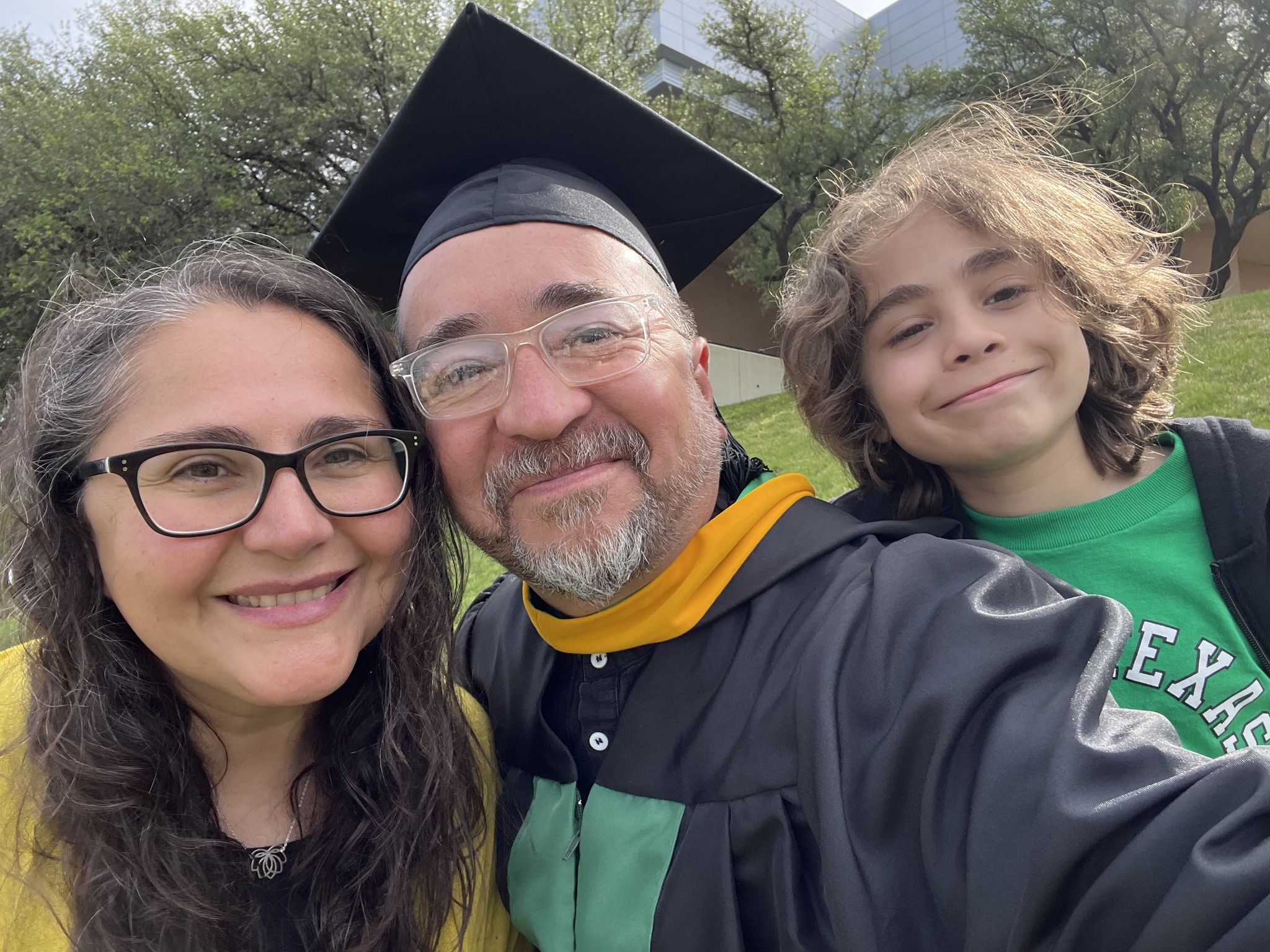
No plans to walk; being done was good enough. My wife, the lovely mother of my child, convinced me otherwise. It would be special for our son to see his old man put on a gown and a funky hat and do something cool! No doubt, indeed, and it was most special for me to see that son sending kisses, cheers, and love from the stands!
I submitted my first draft at the start of April and received quality feedback. I really mean that because this was the first course where the professor met with us one-on-one to provide feedback and discuss our project. It was very valuable and I am grateful for Dr. Quintanar and her support throughout this course. I revised my work and finalized my paper, code and presentation.
My capstone experience project (M.S. Advanced Data Analytics), was an exploration and analysis of Fall 2023 U.S. college enrollment data (115K records, 5,900+ institutions) to uncover demographic patterns and predict graduate enrollment.
Key Findings:
Women consistently outnumber men in enrollment, with the gap widening at the graduate level (60.6% vs. 39.4%).
Hispanic student representation drops sharply from undergrad (25.6%) to graduate (15.2%).
Institutional size distribution is highly skewed (median 588 vs. mean 3,332).
**Models Utilized: Linear Regression, Decision Trees, and Random Forest.
Best performer: Random Forest (R² ≈ 0.78, MAE ~631).
Strongest predictors of graduate enrollment: female enrollment and Asian student representation.
Apart from the delays in receiving timely or helpful feedback on grades, this was an excellent course! It provided a solid introduction to foundational deep learning concepts. The practical components were particularly beneficial; at this stage in my journey, the step-by-step guidance provided in the video lectures was exactly what I needed to bridge the gap between theory and application. Utilizing jupyter notebooks via the cloud based Google Colab was super helpful.
Assignment 4: MNIST and Convolutional Neural Networks
This assignment challenged us to build, train, and test a Convolutional Neural Network (CNN) using the MNIST dataset using TensorFlow. While the lectures provided a clear roadmap, implementing the code was rarely simple. It required constant tweaking and troubleshooting to ensure everything functioned correctly. Despite the hurdles, seeing the structure, flow, and internal processes of a model in action was incredibly insightful.
Assignment 5: Comparing Architectures (RNNs and GANs)
This assignment shifted from hands-on coding work toward a conceptual and research based exercise. I produced two reports comparing the CNNs from the previous assignment to Recurrent Neural Networks (RNNs) and Generative Adversarial Networks (GANs).
The distinctions are fascinating:
CNNs vs. RNNs: While CNNs excel at processing spatial correlations—analyzing data in grids from top-to-bottom and left-to-right—RNNs are designed for sequential data. They excel at predicting what comes next in a series, making them ideal for time-series or language tasks.
CNNs vs. GANs: While CNNs are built for detection and classification, GANs focus on creation. They learn patterns from existing data distributions to generate entirely new, realistic data points.
The Final Project: From MNIST to CIFAR-10
The final project extended our work with CNNs by moving from the simple MNIST digits to the more complex CIFAR-10 dataset. This required loading 10 diverse classes of color images, building a new model, and attempting to improve upon its performance.
The contrast in results was a great lesson in data complexity. The MNIST model hit 99% accuracy within just 2,500 steps. In comparison, the CIFAR-10 model only reached 70% accuracy after 10,000 steps. It was a clear demonstration of how dataset sophistication directly impacts model performance and training requirements.
Looking Ahead
This was undoubtedly an intense, fast-paced course, but the exposure to the world of deep learning has been intriguing. It’s definitely a field that I look forward to exploring further. For now, however, it’s time to pivot back to my Capstone Project. Since we wrapped up a bit earlier than expected, I might actually get to enjoy a true break this Spring ‘Break’!
The first major assignment I submitted for our Analytics Capstone Experience was the Concept Paper which includes four sections: Introduction, The Dataset, Research Question, and finally, a discussion of the methodology, tools, and techniques that would be utilized for the analysis. My concept paper outlines an exploration and analysis of a dataset on US college/university enrollment for Fall 2023. The dataset, EF2023A, comes from the IPEDS (Integrated Postsecondary Education System), which is collected by the US Department of Education’s National Center for Education Statistics (NCES).
The project’s goal, as stated in the concept paper, is to analyze and understand enrollment trends, disparities, and the impact of demographic factors on general enrollment.
After this concept paper, the next assignment is a scholarly review, which is due in about two weeks. Considering that I’ve only been taking 8-week courses, this course seems to be going a bit slow, but I need to be careful and not procrastinate or get distracted. Although the first draft is not due until April 4, I need to make sure that I utilize the month of March effectively. Of course, there will be overlap in the first couple of weeks; however, the month of March basically comes down to two weeks to finalize my deep learning course and two weeks to finalize my draft. If I can make significant progress on both or either of these during the first week of March, then I may be able to enjoy Spring Break as some actual ‘break’ time! But, after that, it’ll be time to lock in and wrap up strong. Finally, if all goes well, graduation will be mid-May! That’s the plan.
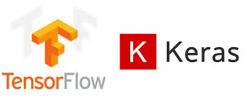
Thankfully, the deep learning course professor graciously allowed us to utilize Google Colab for all of the Jupyter notebook assignments instead of the proposed full week session on setting everything up on GCP (Google Cloud Platform). The course has moved quite rapidly after that first assignment (set up environment and a broad overview of AI/ML/DL). The second assignment included demonstrating the differences and similarities between biological neural netwoks and artificial neural networks. It also required having a basic understanding of linear algebra (matrices, vectors, etc.) and then applying it with several problems. Finally, we were introduced to TensorFlow (an open-source library created by the Google Brain team that is used for large-scale AI machine learning and deep learning projects). The assignment required utilizing basic TensorFlow in a Jupyter notebook (Google Colab). After that assignment, I decided to take a quick crash course on TensorFlow (TensorFlow: Practical Skills in Constructing, Training, and Optimizing Models) to help support my understanding of this library.
For the next assignment we were introduced to Keras (another open-source, user-friendly Python library used for building and experimenting with deep neural networks. It is known for its simplicity and readability.) The assignment required demonstrating an understanding of one-hot encoding and then applying it (using Keras) on the Iris dataset.
Next, we had to design an MLP–fully connected neural network (as had been covered in the lecture material) using Keras on the Iris dataset. We imported libraries, set the seed (ensuring the random process in the code is reproducible in a consistent manner), loaded the data, obtained basic info on the dataset, performed train-test-split, one-hot encoding, ran the model, plotted the results, and, finally, scored the model. I was definitely learning a lot but the bulk of the code was provided to us and there was a lot of support as we went along which was good and helpful (I’d be lost otherwise!). It’s a good starting point but I look forward to continuing to apply these skills to other data sets on my own.
The midterm exam covered both theory (open ended questions demonstrating understanding of the history and the concepts of AI, ML, DL) and application (build, train, and evaluate a deep neural network MLP that has two layers using Keras and the pima diabetes dataset). So for, this course has quickly covered some difficult and heavy concepts and material (linear algebra, artificial neural networks, etc.). It’s an 8 week course on deep learning! I have been very grateful to have NotebookLM to help me summarize and make the material accessible to me in a way that helps me better grasp these concepts and asking as many clarifying questions when I’m not understanding something is super helpful. The most fun has been listening to a podcast of the lecture and materials on my drive to work. It’s helped me review the material several times over. Since the model is only working with the material I upload (class slides, lecture transcripts, etc.) it prevents it from hallucinating, etc. The potential power of something like NotebookLM for all of K-12 education is potentially revolutionary and transformational!
I’ve begun my final stretch for the Master of Science program in Advanced Data Analytics! The ADTA 5940 Analytics Capstone Experience is my first full semester (16 weeks) course since I was in the information science program back in 2020. I’ve also started the semester taking a separate 8 week course at the start of the semester–ADTA 5550 Deep Learning with Big Data.
The capstone experience “requires a significant project about which students periodically report, highlighting the interdisciplinary nature of their findings and its relevance to their interests and/or career goals.” We are required to identify/choose a data set, then developing a problem statement/hypothesis statement, creating a concept paper (1st deliverable), writing a scholarly industry review on the subject of the data set, writing a first draft, revising it and then finalizing the research paper including all of the analysis concluding with a final presentation.
According to the syllabus, the deep learning course “…introduces the fundamentals of artificial neural networks (ANN), the bedrock foundation of the current trend in AI deep learning. The course provides the student with a guide through how to use TensorFlow, the most popular AI framework at present, to build artificial neural networks for deep learning. Besides TensorFlow, Keras, another widely used AI framework that is often used along with TensorFlow in deep-learning projects, will be discussed. The course focuses on the convolutional neural network that has driven the latest breakthroughs in the AI field especially image recognition. This course covers both the theory and the practical implementation of the AI network. As the fundamentals are discussed exemplary AI techniques will be employed to illustrate how AI deep learning theories can be applied to real-world solutions using various programming and system tools.”
There is some pressure since not only am I taking two advanced courses, I am also on my 5th year in the program and I do not think I can extend this any longer after this semester. Yep, just a tad bit nervous, but, here we go!
Final Project for ADTA 5410 Applications and Deployment of Advanced Analytics
Analyze Demographic Factors and Predict College Completion Tools:Python (pandas, scikit-learn, matplotlib), Jupyter Notebook
This project analyzed 2022–2023 college degree completions across 16,000+ U.S. institutions** to uncover the strongest demographic predictors of success.
Key Findings:
Female completions were the most influential factor.
Non-traditional students (ages 25–39) play a critical role in completions.
Random Forest achieved ~99% accuracy, outperforming logistic regression and decision trees.
According to the description in the syllabus for 5410 Applications and Deployment of Advanced Analytics, this course, “…focuses on using advanced analytics in practical case studies to help students develop the skills needed to address complex challenges in industry and business.” The course required the prerequisites of most, if not all, the courses I had taken so far in the program.
The course consisted of 8 modules that began with a crash intro to Python and then moved quickly to ‘Data Exploration and Visualization’ where I explored US College Data using Pandas. Next, we explored a tool called PandasAI with the Titanic dataset and also worked with the process of imputation while doing an exploratory analysis of a west Texas oil fields dataset. All of these assignments required a jupyter notebook with our Python code and a separate pdf written description of the step by step analysis we undertook. For the third assignment of the course we learned about and ran a linear regression of a data set of diamond prices. By this time, I had chosen my data set for my final project and had to submit my research proposal that consisted of the research question, the dataset, the target variable, and, the methodology for the analysis. From here, we explored and used logistic regression using customer acquisition data and then a separate assignment using logistic regression to predict loan default with regularization techniques. Next, we explored Stepwise Regression and Decision Tree models to predict diabetes. The goal was to utilize the diabetes dataset and build two models to predict whether a patient is diabetic based on various health attributes. Next, we used the same dataset but used Random Forest with Hyperparameter Tuning to also predict wheter a patient is diabetic based on various attributes. The course content concluded with an introduction and exploration of neural nets leaving us to finalize and submit our final project.
Final Project: Demographic Factors and College Completion
Tools Utilized: Python, Google Colab, Jupyter Notebooks, GitHub
Skills Acquired: Apply experimental Design, sampling methodologies, parametric and non-parametric tests, linear regression models (analyze, test, improve). Integrate various data analysis techniques and use statistical software tools and programming applications to perform advanced data analysis on a real world project and effectively display the results.
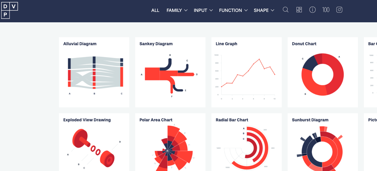
I’ve been working on the Advanced Data Visualization with Tableau course while taking breaks from 5410 and finally completed it! It is the 6th course in the Tableau Business Intelligence Analyst Professional certificate and I have 2 more to go! It has been a great course and it provided a nice (and fun!) break from the heavier mental work load of 5410. I loved the consistent structure and format in which each chart type was introduced, taught and then modeled. The course covered motion charts, dual-axis charts, gantt charts, bar-in-bar charts, donut charts, funnel charts, waterfall charts, sparkline charts, map layers, lasso/radial selection, and, polygon maps. It was intense but I hope/need to come back and practice these more slowly and create some custom versions of my own after getting through 5410! Speaking of, I got to get back to wrapping that up. Before that, here is one of my favorite chart resources out there on the wild web.
It has been super helpful and will definitely stay at the top of my data viz bookmarks.
My previous data visualization course only briefly introduced us to Tableau because the course was more of a broad overview of data visualization and communication principles in general. It introduced various tools along the way including Excel, PowerBI, Python, and, Tableau. We had the option to use any one of these tools for our various assignments and I mostly stuck with Excel because it was the tool that I was most familiar with when it came to charts, graphs, etc. I did transition to utilizing Plotly for Python for my final project.
So, considering my recent exploration of Tableau, I was excited to find out that this course, Large Data Visualization utilized Tableau as the primary tool. What I loved about this course, however, was that it was not a course simply teaching Tableau. It included lots of hands-on projects along the way, as well as, content on data visualization theory and best practices. It required you to learn and develop your Tableau skills (if you didn’t already have them) in order to complete the projects. The intro modules included a quick overview of data literacy and I was re-introduced to Florence Nightingale, John Snow’s cholera map, and, Edward Tufte’s work by way of the Art of Data Visualization documentary (which was a little dated but still relevant).
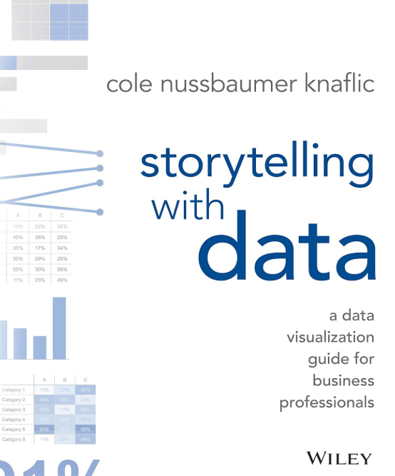
I had come across the book, “Storytelling with Data” multiple times before but had not made the time to actually read through it. I was happy to find out that this was a required text. Unlike other required texts in other courses, this book was, fortunately, used extensively throughout the course.
Apart from installing and setting up Tableau, the first assignment consisted of, first, finding and choosing a dataset. I chose the CIRIGHTS data set, which according to the site is the “largest human rights dataset in the world.” This project scores a representative sample of all internationally recognized human rights for all countries of the world covering 40 years. The next part was to compile an accompanying data dictionary for the dataset.
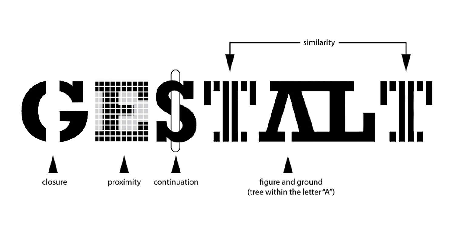
The next module continued with the theory behind the rationale for the use of data visualization (The Why of Data Viz) and an introduction to Tableau Prep. The assignment deliverable required that we demonstrate that we could utilize Tablea Prep for our chosen data set (connect to it, review/implement it’s prep recommendations, and, utilize the Flow pane). The course continued with design and visualization theory utilizing readings and content from the textbook and also utilizing Tableau to begin creating basic and then more advanced charts with our chosen dataset (including getting critique/feedback from others and revising our charts based on that feedback). One of the biggest takeaways from the book for me was how much I was able to understand/grasp the importance of the Gestalt principles when creating data visualizations.
I just completed the Data Ecosystem course, the 5th course in the Tableau Business Intelligence Analyst Professional certificate. It covered databases, data warehouses, data lakes, data architecture, data quality, data governance, and data management. Although it was very much an overview of these topics, I enjoyed the course and learned a lot about the “data engineering” side of things. A lot of which was new to me and it’s important that I learn these concepts even if it’s just knowing what it is and why it’s important or what role it plays in the field.
A packed schedule awaits me next semester. I had already postponed 5410 Deployment of Advanced Analytics, and now I’ll be taking another elective, which looks like it will be 5250 Large Data Visualization. Tableau appears to be the required and primary tool. For some reason, I’ve been avoiding truly diving in to this tool.
My interest in D3 and interactive data visualization is still strong, but I have to make some difficult decisions due to time constraints (graduate studies and a full time job!). I’ve enjoyed my venture into Tableau and, although D3 is by far a better tool when it comes to the bespoke interactive options and flexibility, Tableau is quite robust and it is very much an industry standard go-to when it comes to BI options. Up to this point in my data learning journey I’ve been avoiding diving into Tableau due to my plans to eventually really learn and work with D3. However, this upcoming class has now forced me to, at least for now, focus on giving Tableau a very serious exploration, delving into it more deeply than I every have before.
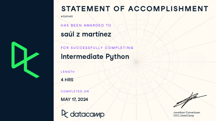
Unfortunately, due to various personal and work conflicts, I had to postpone 5410 Deployment of Advanced Analytics until next semester. Knowing that it will be Python heavy, I decided to brush up and prepare by completing the Introduction to Python for Developers and the Intermediate Python courses on Datacamp. I’m beginning to feel a lot more confident with Python where instead of just copying code, I’m able to read it now and edit it as needed. Definitely not fluent but a lot more comfortable with reading and revising it as needed. Apart from that, I also completed the Prompt Engineering: How to Talk to the AIs course on LinkedIn Learning to explore some best practices, strategies and examples of good prompt engineering.
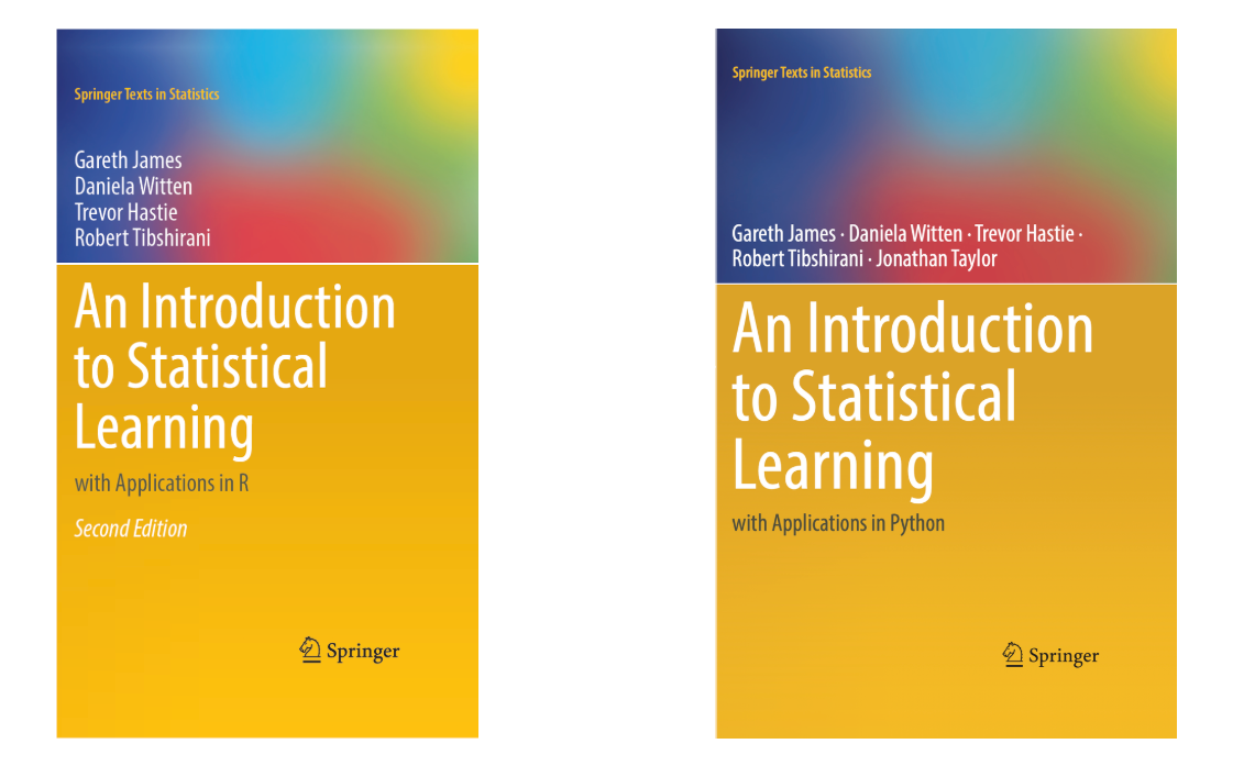
Knowing that I only have a few courses to go before I graduate makes me both excited and quite a bit nervous. Instead of taking 2 (8 week) courses this semester I will only be taking 1 (5410 Deployment of Advanced Analytics) and it will start in March. The professor shared an old 8 week syllabus with me and stated that the main adjustment is that the course will be in Python and not in R. I have been trying to improve my R skills via the Posit tutorials and others but I may have to switch gears. The professor’s rationale in the e-mail response makes sense. Python has won out in this space and it makes sense to prepare students with the tools where more jobs are available. He did recommend that I prepare by going to the Statlearning site and reviewing the material there. The site and resources reminds me a lot of the OpenStatistics companion site and how helpful the set up and the resources were. The other positive about this text and site is that it offers both applications in R and Python.
Anticipating this move from R to Python in the program, I went back for another Python refresher and completed the Intro to Python course on Datacamp and the new 2023 version of the Python Quick Start course on LinkedIn. I had previously completed the 2019 release in 2021. I also completed the overview Introduction to Data Science ‘crash’ course (2 hours) by Madecraft on LinkedIn Learning.
Also, considering my lack of interest in Python’s data visualization tools and that D3 requires a time intensive commitment (that’s definitely not feasible right now with what’s on my my plate) I’m moving towards exploring Tableau as my data visualization tool. So, I completed the Introduction to Tableau course also on DataCamp and it is definitely a tool that I want to keep exploring.
The course 5340 Discovery and Learning with Big Data seemed to be carrying over a title from a different era because by this time the term “Big Data” isn’t really en vogue anymore. Is there any other data now? I think this course could have easily been titled “An Introduction to Machine Learning utilizing Python”. It began with a crash course/review of Python in order to utilize it going forward via a Jupyter notebook environment. Just like posit Cloud was a great resource and tool for learning and utilizing the R programming language in my previous course, this time I discovered Google Colab and I was in love! Unfortunately, we still had to go through all of the Anaconda local installation and environment configuration process for our first assignment. Thankfully, our professor agreed to let us use Anaconda Cloud and Google Colab for the rest of the assignments and classwork. I tried Anaconda Cloud and really wanted to like it. They had great Python courses, etc. However, in the end, Google Colab won out for me.
The crash course in Python at the start of the course consisted of 12 homework assignments/exercises that included programming basics, basic Python data types, data structures (lists, range, strings, tuples, series, dataframes, NumPy arrays). The lectures began with the basics of the data analytics life cycle and exploratory data analysis including data visualization utilizing MatplotLib which I did not care for at all. Just plain ugly. By this time I had already used Plotly for Python, Seaborn, Altair, and Bokeh and preferred any of them over MatPlotLib.
The rest of the course moved rapidly from an introduction to Machine Learning using Python (NumPy, Pandas, SciKIt-Learn) to rapidly covering Supervised Machine Learning (Linear and Logistic Regression, CART & KNN), Unsupervised Machine Learning (KMeans, Anomaly Detection), and the The Azure Machine Learning Studio (a drag and drop, wireframe, no code ML tool).
Tools Utilized: Python (NumPy, Pandas, Scikit-Learn) Jupyter Notebooks, Google Colab, Microsoft Machine Learning Studio (Azure) Skills Acquired/Developed: Data analytics cycle, preprocessing, Exploratory Data Analysis (EDA), Supervised Machine Learning Algorithms, Supervised Non-Linear Algorithms, Unsupervised Algorithms, Evaluating Algorithms
If 5130 Data Analytics 1 seemed like a crash course in basic R and Statistics 101 then 5230 Data Analytics II seemed like a crash course in advanced R and machine learning!
It was intense and the most difficult course I’ve taken in this program. The pace of the class and the professor assumed a strong background in R that I, obviously, did not have. Unfortunately, after attending office hours, etc. I had to hire an R tutor to help explain to me what the code I was copying/pasting was actually doing. I was also even more grateful for Posit.cloud than I had been in my previous course. I used it extensively for this course and really enjoyed the overall experience, the resources it provides and not having to mess with installation rituals, downloads, command line, etc. since it was all web-based and ready to get you to code.
The course was meant to be an extension of of the concepts introduced in Data Analytics I including multivariate analysis, classification methods, association rules, dimension reduction, performance evaluation, multiple and logistic regression, k-Nearest Neighbors (k-NN), Naive Bayes classifier, decision trees, Neural Nets and discriminant analysis. However, the pace was much more rushed and the content much more dense which makes sense since it is DA II but the professor and the structure of the course was not very helpful and I had to rely on a lot of outside support and supplementary materials to get through the class and really grasp many of the concepts in order to successfully complete the assignments.
Tools Utilized: Excel, R statistical programming language, POSIT (web-based R-Studio application) Skills Acquired/Developed: Multivariate and unstructured data analysis, classification methods, association rules, dimension reduction, performance evaluation, multiple and logistic regression, K-Nearest neighbors (k-NN), Naive Bayes classifier, decision trees, Neural Nets and discriminant analysis.
I recently completed 5130 Data Analytics I which was basically a crash course in basic R and Statistics 101. The professor was a full time data scientiest for Lockheed Martin, so, he definitely took an applied approach throughout the course. The course utilized OpenIntro Statistics as the main textbook. It is open source and had a lot of supplementary resources like videos, slides and labs for each chapter. Although it is not free, these resources definitely make it worth the price and more!
Although we mostly utilized Excel at the start of the course, it soon became my applied introduction to the R programming language! I’m thankful that I discovered Posit.cloud. The site was super helpful and intuitive in getting me working with and learning to work with R. The tutorials and cheat sheets were super helpful and best of all, the cloud based set up gets you to work right away with no complicated set ups, downloads, etc.
The course was an applied overview of quantitative methods essential for analyzing data, with an emphasis on business and industry applications. Topics included identification of appropriate metrics and measurement methods, descriptive and inferential statistics, experimental design, parametric and non-parametric tests, simulation, and linear and logistic regression, categorical data analysis, and select unsupervised learning techniques.
Tools Utilized: Excel, R statistical programming language, POSIT (web-based R-Studio application) Skills Acquired: Basic descriptive and inferential statistics, experimental design, linear/logistic regression, supervised and unsupervised learning techniques
The class 5240 Harvesting, Storing and Retrieving Data began with a section that was a crash course in Big Data (Structured, Unstructured, Semistructured, the 5 V’s of big data (Volume, Variety, Veracity, Velocity, Value), etc.) It quickly pivoted to primarily focusing on utilizing the Google Cloud Platform data analytics (BigQuery) and database (BigTable, Spanner and Cloud SQL) tools.
It was a solid mix of theory and practice. In fact, the midterm consisted of both a theory portion and a hands-on lab portion. It provided an introduction to collecting, storing, managing, retrieving and processing datasets. Techniques for large and small datasets were considered, as both are needed in data science applications. Traditional survey and experimental design principles for data collection as well as script-based programming techniques for large-scale data harvesting from third party sources were covered. Data wrangling methodologies were introduced for cleaning and merging datasets, storing data for later analysis and constructing derived datasets. Various storage and process architectures were introduced with a focus on how approaches depend on applications, data velocity and end users. Emphasizes applications and includes many hands-on projects.
A few of the tasks were particularly overwhelming since I had never utilized the Google Cloud Platform and it was critical to keep tabs of your usage, etc. Although the tools were similar to other data analtyics and data science tools, the proprietary nature of the processes and click throughs to complete a task were sometimes not very intuitive. So, all that to say that there was a bit of a learning curve. However, The professor of the course was super helpful and provided step by step guidance as needed.
Tools Utilized: Google Cloud Platform (BigQuery, Bigtable, Cloud SQL, Cloud Spanner) Skills Acquired: Collect, store, manage, retrieve, process data sets utilizing the Google Cloud Platform.
Now, after completing those two courses–Data Analysis and Knowledge Discovery and Data Visualization and Communication, I have decided to end my brief journey in the Information Science graduate program to pursue a Master of Science in Advanced Data Analytics. My love and interest in the field of information science will remain strong and I will continue to explore this field and its sub-fields any opportunity that I get.
For now, however, I will be taking a break for the Fall. Working as a full time teacher with a child at home only leaves me a few hours in the evenings and weekends for my studies and it hasn’t been easy. I hope I can manage this new challenge. I will begin the new program in the Spring with - Data Analytics 1 and Harvesting, Storage and Retrieval of Data.
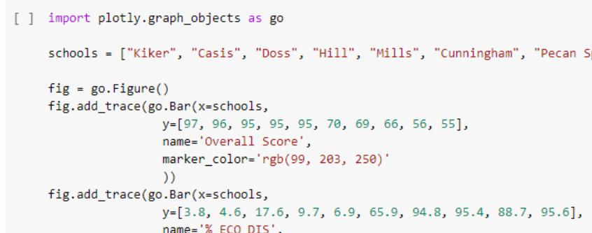
An analysis of the AustinISD Texas Education Agency accountability statewide ratings for 2019.
Course Description: Introduces principles and techniques for data visualization for creating meaningful displays of quantitative and qualitative data to facilitate decision-making. Emphasis is placed on the identification of patterns, trends and differences among data sets.
The tools used in the course included Excel, PowerBI, Tableau, Python (MatPlotLib, Seaborn, Plotly) and covered graphic design principles (color, text, interaction, perception), exploratory data analysis, and implementing data visualization techniques through charts and interactive dashboards. To supplement this intro into data visualization, I also completed the Python for Data Visualization and Data Visualization with Plotly courses during this semester. These two courses helped me to utilize Plotly for Python in my final project.
The course utilized the book Microsoft Excel: Data Analysis and Business Modeling and it was significantly utilized throughout the course. The course began with an introduction to data analysis and then then covered data mining, text mining and knowledge discovery principles, concepts, theories and practices.
For the second part of the course (Text Mining and Classification), the primary tool utilized was RapidMiner. The no code (node based) environment was new and different for me.
My final project for this part of the course was a text analysis of Google’s Python Crash Course Coursera Reviews for the year 2020. The original data set file for this project was obtained from Kaggle and it was collected by Muhmammad Nakhaee. The text analysis techniques utilized for this project were association analysis and cluster (k-means) analysis. Here is the detailed report of the analysis which details the process for both techniques using RapidMiner and the conclusions of the analysis.
Tools Utilized: Excel, RapidMiner Skills Acquired/Developed: Spreadsheet Modeling Basics - Lookup, Index, Match Functions, Pivot Tables, Array Formulas, Charts and Dashboards, Data Mining Basics - Data Prep, Correlation Methods, Association Rules, K-Means Clustering, Discriminant Analysis, k-nearest neighbors, Naive Bayes, Text Mining, Decision Trees, Neural Networks
Apart from that, my interest in data analytics and data science continues to grow so I completed another quick intro/review of the basics – (Learning Data Science: Understanding the Basics). I feel a bit conflicted. I don’t see myself fully in information science but I don’t think I would survive the data science. I’d like to continue to explore working with data but in a more applied path/role.
After taking the Python for Data Science and AI course this summer, I’ve wondered if I should have at least applied to the Data Science program. However, my lack of background in linear algebra and calculus (or any math for that matter!) was the primary reason that discouraged me from doing so. Instead, I began my journey in the Master of Science program in Information Science this past semester. It is by no means a compromise, since Information Science, Information Organization, Information Architecture have all been strong interests of mine for a very long time now. I chose to pursue the Information Systems concentration; however, the Information Organization and Knowledge Management paths also looked appealing.
According the program’s website, the Information Science program focuses on “the knowledge, theory, and technology dealing with the collection of both traditional and digital information resources, and the user-oriented processes and methods involved in their manipulation, storage, dissemination, publication and retrieval.” I am definitely very interested in the cross-section between data science and information science–when does data become information and vice versa, and how do they relate to each other? I know that in simple terms, data is raw and is then processed in some way to become meaningful information, but I think the difference may be a bit more complex and nuanced(messier?) than that.
One of the two courses (INFO 5000 - Information and Knowledge Professions) that I took was a bit boring and simply introduced the various professions and an overview of careers in the broad area of information science. The second course (INFO 5200 - Information Organization), however, was much more interesting and a bit challenging. At the start of the course, the professor mentioned that many thought that this was ‘just a database’ class and emphasized that this was much more than that. He preferred the use of the term “Information Retrieval System” and stated in his initial lecture that we would be learning about all the processes the go into “…creating a decent information retrieval system” and clarified that what he meant by ‘decent’ was that it would be “usable by the intended users.” We utilized the book, “The Organization of Information” and referenced it throughout the course.
The major and final assignment for the class was the IOP (Information Organization Project). A very helpful part of this course was that we worked on various assignments along the way that would then make up the final project and feedback was provided on each of those sections (drafts 1-4, SWOT Analysis, concept briefing) along the way. However, even with that support, this class was a lot more difficult than I thought. My IOP was an information organization/retrieval system for a UX/UI Design for Web Programmers collection. It was ok, but there was definitely a lot of room for improvement, not just in terms of the work but in my own understanding of the complex details that go into designing an information system like this.
No plans to walk; being done was good enough. My wife, the lovely mother of my child, convinced me otherwise. It would be special for our son to see his old man put on a gown and a funky hat and do something cool! No doubt, indeed, and it was most special for me to see that son sending kisses, cheers, and love from the stands!
And now (and for the rest of this semester!), it’s time to focus on my deep learning course (for the next 8 weeks) and the capstone experience for the rest of the semester up to graduation in May!
I’ve been working on the Advanced Data Visualization with Tableau course while taking breaks from 5410 and finally completed it! It is the 6th course in the Tableau Business Intelligence Analyst Professional certificate and I have 2 more to go! It has been a great course and it provided a nice (and fun!) break from the heavier mental work load of 5410. I loved the consistent structure and format in which each chart type was introduced, taught and then modeled. The course covered motion charts, dual-axis charts, gantt charts, bar-in-bar charts, donut charts, funnel charts, waterfall charts, sparkline charts, map layers, lasso/radial selection, and, polygon maps. It was intense but I hope/need to come back and practice these more slowly and create some custom versions of my own after getting through 5410! Speaking of, I got to get back to wrapping that up. Before that, here is one of my favorite chart resources out there on the wild web.
It has been super helpful and will definitely stay at the top of my data viz bookmarks.
My previous data visualization course only briefly introduced us to Tableau because the course was more of a broad overview of data visualization and communication principles in general. It introduced various tools along the way including Excel, PowerBI, Python, and, Tableau. We had the option to use any one of these tools for our various assignments and I mostly stuck with Excel because it was the tool that I was most familiar with when it came to charts, graphs, etc. I did transition to utilizing Plotly for Python for my final project.
So, considering my recent exploration of Tableau, I was excited to find out that this course, Large Data Visualization utilized Tableau as the primary tool. What I loved about this course, however, was that it was not a course simply teaching Tableau. It included lots of hands-on projects along the way, as well as, content on data visualization theory and best practices. It required you to learn and develop your Tableau skills (if you didn’t already have them) in order to complete the projects. The intro modules included a quick overview of data literacy and I was re-introduced to Florence Nightingale, John Snow’s cholera map, and, Edward Tufte’s work by way of the Art of Data Visualization documentary (which was a little dated but still relevant).
I had come across the book, “Storytelling with Data” multiple times before but had not made the time to actually read through it. I was happy to find out that this was a required text. Unlike other required texts in other courses, this book was, fortunately, used extensively throughout the course.
Apart from installing and setting up Tableau, the first assignment consisted of, first, finding and choosing a dataset. I chose the CIRIGHTS data set, which according to the site is the “largest human rights dataset in the world.” This project scores a representative sample of all internationally recognized human rights for all countries of the world covering 40 years. The next part was to compile an accompanying data dictionary for the dataset.
The next module continued with the theory behind the rationale for the use of data visualization (The Why of Data Viz) and an introduction to Tableau Prep. The assignment deliverable required that we demonstrate that we could utilize Tablea Prep for our chosen data set (connect to it, review/implement it’s prep recommendations, and, utilize the Flow pane). The course continued with design and visualization theory utilizing readings and content from the textbook and also utilizing Tableau to begin creating basic and then more advanced charts with our chosen dataset (including getting critique/feedback from others and revising our charts based on that feedback). One of the biggest takeaways from the book for me was how much I was able to understand/grasp the importance of the Gestalt principles when creating data visualizations.
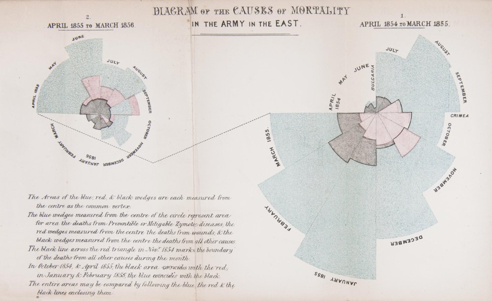
It’s hard not to be enamored by the work of the data visualization pioneer, Florence Nightingale who worked with the sturdy and reliable tools of plain pen and paper in the 1850s. The exquisite detail utilized to address a very specific problem and demonstrate the power of visualization is very impactful. She utilized a mortality diagram (a polar area chart) where each wedge represented a month.
The area of the wedge shows the number of soldiers who died that month. The blue/gray area represented deaths from preventable diseases (due to terrible conditons), the red areas represented deaths from battlefield wounds, and, finally, the black areas represented deaths from other causes. Her core question was, “Why are these men dying?” was the driver and the problem she was trying to address with her visualization. In the 1850s, she knew the power of visualization to communicate an insight powerfully and effectively. She was able to demonstrate to powerful stakeholders that more soldiers were dying from preventable diseases than from battefield wounds countering the belief that most deaths came from wounds. This insight led to changes that had a huge positive impact and difference in mortality (death rates decreased).
I just completed the Data Ecosystem course, the 5th course in the Tableau Business Intelligence Analyst Professional certificate. It covered databases, data warehouses, data lakes, data architecture, data quality, data governance, and data management. Although it was very much an overview of these topics, I enjoyed the course and learned a lot about the “data engineering” side of things. A lot of which was new to me and it’s important that I learn these concepts even if it’s just knowing what it is and why it’s important or what role it plays in the field.
A packed schedule awaits me next semester. I had already postponed 5410 Deployment of Advanced Analytics, and now I’ll be taking another elective, which looks like it will be 5250 Large Data Visualization. Tableau appears to be the required and primary tool. For some reason, I’ve been avoiding truly diving in to this tool.
My interest in D3 and interactive data visualization is still strong, but I have to make some difficult decisions due to time constraints (graduate studies and a full time job!). I’ve enjoyed my venture into Tableau and, although D3 is by far a better tool when it comes to the bespoke interactive options and flexibility, Tableau is quite robust and it is very much an industry standard go-to when it comes to BI options. Up to this point in my data learning journey I’ve been avoiding diving into Tableau due to my plans to eventually really learn and work with D3. However, this upcoming class has now forced me to, at least for now, focus on giving Tableau a very serious exploration, delving into it more deeply than I every have before.
Knowing that I only have a few courses to go before I graduate makes me both excited and quite a bit nervous. Instead of taking 2 (8 week) courses this semester I will only be taking 1 (5410 Deployment of Advanced Analytics) and it will start in March. The professor shared an old 8 week syllabus with me and stated that the main adjustment is that the course will be in Python and not in R. I have been trying to improve my R skills via the Posit tutorials and others but I may have to switch gears. The professor’s rationale in the e-mail response makes sense. Python has won out in this space and it makes sense to prepare students with the tools where more jobs are available. He did recommend that I prepare by going to the Statlearning site and reviewing the material there. The site and resources reminds me a lot of the OpenStatistics companion site and how helpful the set up and the resources were. The other positive about this text and site is that it offers both applications in R and Python.
Anticipating this move from R to Python in the program, I went back for another Python refresher and completed the Intro to Python course on Datacamp and the new 2023 version of the Python Quick Start course on LinkedIn. I had previously completed the 2019 release in 2021. I also completed the overview Introduction to Data Science ‘crash’ course (2 hours) by Madecraft on LinkedIn Learning.
Also, considering my lack of interest in Python’s data visualization tools and that D3 requires a time intensive commitment (that’s definitely not feasible right now with what’s on my my plate) I’m moving towards exploring Tableau as my data visualization tool. So, I completed the Introduction to Tableau course also on DataCamp and it is definitely a tool that I want to keep exploring.
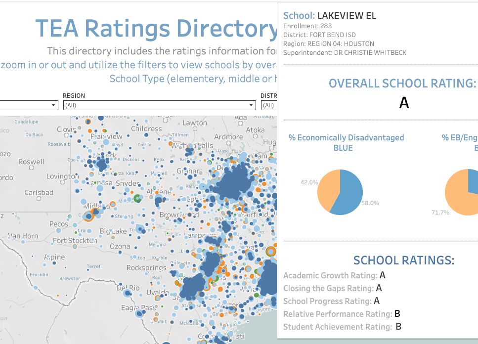
When I began the Information Science graduate program, I took the course Data Analysis and Knowledge Discovery and it led me to transfer to the Advanced Data Analytics program. The final project for that course was a side by side comparison tool of the 2019 TEA Ratings. It was originally created with Excel using advanced look up functions and formulas, etc. but was then transferred to Google sheets. It functioned well but I couldn’t stop thinking/dreaming about creating a web based version of this tool.
So, a few years after that project and a year after ChatGPT’s debut, I fulfilled that dream! With the assistance of ChatGPT (lots of iterating back and forth and copy/pasting code, etc.), I created that web based version using only html, css, and javascript. Far from perfect but not a bad start!
I recently completed 5130 Data Analytics I which was basically a crash course in basic R and Statistics 101. The professor was a full time data scientiest for Lockheed Martin, so, he definitely took an applied approach throughout the course. The course utilized OpenIntro Statistics as the main textbook. It is open source and had a lot of supplementary resources like videos, slides and labs for each chapter. Although it is not free, these resources definitely make it worth the price and more!
Although we mostly utilized Excel at the start of the course, it soon became my applied introduction to the R programming language! I’m thankful that I discovered Posit.cloud. The site was super helpful and intuitive in getting me working with and learning to work with R. The tutorials and cheat sheets were super helpful and best of all, the cloud based set up gets you to work right away with no complicated set ups, downloads, etc.
The course was an applied overview of quantitative methods essential for analyzing data, with an emphasis on business and industry applications. Topics included identification of appropriate metrics and measurement methods, descriptive and inferential statistics, experimental design, parametric and non-parametric tests, simulation, and linear and logistic regression, categorical data analysis, and select unsupervised learning techniques.
Tools Utilized: Excel, R statistical programming language, POSIT (web-based R-Studio application) Skills Acquired: Basic descriptive and inferential statistics, experimental design, linear/logistic regression, supervised and unsupervised learning techniques
Now, after completing those two courses–Data Analysis and Knowledge Discovery and Data Visualization and Communication, I have decided to end my brief journey in the Information Science graduate program to pursue a Master of Science in Advanced Data Analytics. My love and interest in the field of information science will remain strong and I will continue to explore this field and its sub-fields any opportunity that I get.
For now, however, I will be taking a break for the Fall. Working as a full time teacher with a child at home only leaves me a few hours in the evenings and weekends for my studies and it hasn’t been easy. I hope I can manage this new challenge. I will begin the new program in the Spring with - Data Analytics 1 and Harvesting, Storage and Retrieval of Data.
The course utilized the book Microsoft Excel: Data Analysis and Business Modeling and it was significantly utilized throughout the course. The course began with an introduction to data analysis and then then covered data mining, text mining and knowledge discovery principles, concepts, theories and practices.
For the second part of the course (Text Mining and Classification), the primary tool utilized was RapidMiner. The no code (node based) environment was new and different for me.
My final project for this part of the course was a text analysis of Google’s Python Crash Course Coursera Reviews for the year 2020. The original data set file for this project was obtained from Kaggle and it was collected by Muhmammad Nakhaee. The text analysis techniques utilized for this project were association analysis and cluster (k-means) analysis. Here is the detailed report of the analysis which details the process for both techniques using RapidMiner and the conclusions of the analysis.
Tools Utilized: Excel, RapidMiner Skills Acquired/Developed: Spreadsheet Modeling Basics - Lookup, Index, Match Functions, Pivot Tables, Array Formulas, Charts and Dashboards, Data Mining Basics - Data Prep, Correlation Methods, Association Rules, K-Means Clustering, Discriminant Analysis, k-nearest neighbors, Naive Bayes, Text Mining, Decision Trees, Neural Networks
Apart from that, my interest in data analytics and data science continues to grow so I completed another quick intro/review of the basics – (Learning Data Science: Understanding the Basics). I feel a bit conflicted. I don’t see myself fully in information science but I don’t think I would survive the data science. I’d like to continue to explore working with data but in a more applied path/role.
To supplement and survive my current course, “Data Analysis and Knowledge Discovery” I have undertaken a simultaneous, accelerated, and self-curated crash set of courses in Excel. This class has quickly taught me that I do not actually know Excel like I thought I did!
This self-curated crash set of courses consisted of the following:
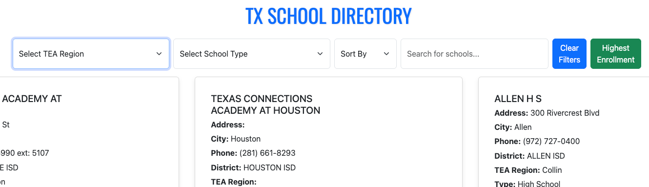
I took the data from a previous project (side by side comparison tool) and created a TEA Ratings Directory Tool 21-22 that features an interactive map of all Texas schools with a pop-up displaying each school’s rating information. The tool can by filtered by rating, region, district type and school type.
The grunt work was getting the coordinates for the map loaded and working correctly in Tableau. The great thing about this set up is that now the base map can be reutilized to show other data in the pop-up. The pop-up can also be redesigned to show other charts, visuals, etc.
The first major assignment I submitted for our Analytics Capstone Experience was the Concept Paper which includes four sections: Introduction, The Dataset, Research Question, and finally, a discussion of the methodology, tools, and techniques that would be utilized for the analysis. My concept paper outlines an exploration and analysis of a dataset on US college/university enrollment for Fall 2023. The dataset, EF2023A, comes from the IPEDS (Integrated Postsecondary Education System), which is collected by the US Department of Education’s National Center for Education Statistics (NCES).
The project’s goal, as stated in the concept paper, is to analyze and understand enrollment trends, disparities, and the impact of demographic factors on general enrollment.
After this concept paper, the next assignment is a scholarly review, which is due in about two weeks. Considering that I’ve only been taking 8-week courses, this course seems to be going a bit slow, but I need to be careful and not procrastinate or get distracted. Although the first draft is not due until April 4, I need to make sure that I utilize the month of March effectively. Of course, there will be overlap in the first couple of weeks; however, the month of March basically comes down to two weeks to finalize my deep learning course and two weeks to finalize my draft. If I can make significant progress on both or either of these during the first week of March, then I may be able to enjoy Spring Break as some actual ‘break’ time! But, after that, it’ll be time to lock in and wrap up strong. Finally, if all goes well, graduation will be mid-May! That’s the plan.
Final Project for ADTA 5410 Applications and Deployment of Advanced Analytics
Analyze Demographic Factors and Predict College Completion Tools:Python (pandas, scikit-learn, matplotlib), Jupyter Notebook
This project analyzed 2022–2023 college degree completions across 16,000+ U.S. institutions** to uncover the strongest demographic predictors of success.
Key Findings:
Female completions were the most influential factor.
Non-traditional students (ages 25–39) play a critical role in completions.
Random Forest achieved ~99% accuracy, outperforming logistic regression and decision trees.
I submitted my first draft at the start of April and received quality feedback. I really mean that because this was the first course where the professor met with us one-on-one to provide feedback and discuss our project. It was very valuable and I am grateful for Dr. Quintanar and her support throughout this course. I revised my work and finalized my paper, code and presentation.
My capstone experience project (M.S. Advanced Data Analytics), was an exploration and analysis of Fall 2023 U.S. college enrollment data (115K records, 5,900+ institutions) to uncover demographic patterns and predict graduate enrollment.
Key Findings:
Women consistently outnumber men in enrollment, with the gap widening at the graduate level (60.6% vs. 39.4%).
Hispanic student representation drops sharply from undergrad (25.6%) to graduate (15.2%).
Institutional size distribution is highly skewed (median 588 vs. mean 3,332).
**Models Utilized: Linear Regression, Decision Trees, and Random Forest.
Best performer: Random Forest (R² ≈ 0.78, MAE ~631).
Strongest predictors of graduate enrollment: female enrollment and Asian student representation.
Apart from the delays in receiving timely or helpful feedback on grades, this was an excellent course! It provided a solid introduction to foundational deep learning concepts. The practical components were particularly beneficial; at this stage in my journey, the step-by-step guidance provided in the video lectures was exactly what I needed to bridge the gap between theory and application. Utilizing jupyter notebooks via the cloud based Google Colab was super helpful.
Assignment 4: MNIST and Convolutional Neural Networks
This assignment challenged us to build, train, and test a Convolutional Neural Network (CNN) using the MNIST dataset using TensorFlow. While the lectures provided a clear roadmap, implementing the code was rarely simple. It required constant tweaking and troubleshooting to ensure everything functioned correctly. Despite the hurdles, seeing the structure, flow, and internal processes of a model in action was incredibly insightful.
Assignment 5: Comparing Architectures (RNNs and GANs)
This assignment shifted from hands-on coding work toward a conceptual and research based exercise. I produced two reports comparing the CNNs from the previous assignment to Recurrent Neural Networks (RNNs) and Generative Adversarial Networks (GANs).
The distinctions are fascinating:
CNNs vs. RNNs: While CNNs excel at processing spatial correlations—analyzing data in grids from top-to-bottom and left-to-right—RNNs are designed for sequential data. They excel at predicting what comes next in a series, making them ideal for time-series or language tasks.
CNNs vs. GANs: While CNNs are built for detection and classification, GANs focus on creation. They learn patterns from existing data distributions to generate entirely new, realistic data points.
The Final Project: From MNIST to CIFAR-10
The final project extended our work with CNNs by moving from the simple MNIST digits to the more complex CIFAR-10 dataset. This required loading 10 diverse classes of color images, building a new model, and attempting to improve upon its performance.
The contrast in results was a great lesson in data complexity. The MNIST model hit 99% accuracy within just 2,500 steps. In comparison, the CIFAR-10 model only reached 70% accuracy after 10,000 steps. It was a clear demonstration of how dataset sophistication directly impacts model performance and training requirements.
Looking Ahead
This was undoubtedly an intense, fast-paced course, but the exposure to the world of deep learning has been intriguing. It’s definitely a field that I look forward to exploring further. For now, however, it’s time to pivot back to my Capstone Project. Since we wrapped up a bit earlier than expected, I might actually get to enjoy a true break this Spring ‘Break’!
The first major assignment I submitted for our Analytics Capstone Experience was the Concept Paper which includes four sections: Introduction, The Dataset, Research Question, and finally, a discussion of the methodology, tools, and techniques that would be utilized for the analysis. My concept paper outlines an exploration and analysis of a dataset on US college/university enrollment for Fall 2023. The dataset, EF2023A, comes from the IPEDS (Integrated Postsecondary Education System), which is collected by the US Department of Education’s National Center for Education Statistics (NCES).
The project’s goal, as stated in the concept paper, is to analyze and understand enrollment trends, disparities, and the impact of demographic factors on general enrollment.
After this concept paper, the next assignment is a scholarly review, which is due in about two weeks. Considering that I’ve only been taking 8-week courses, this course seems to be going a bit slow, but I need to be careful and not procrastinate or get distracted. Although the first draft is not due until April 4, I need to make sure that I utilize the month of March effectively. Of course, there will be overlap in the first couple of weeks; however, the month of March basically comes down to two weeks to finalize my deep learning course and two weeks to finalize my draft. If I can make significant progress on both or either of these during the first week of March, then I may be able to enjoy Spring Break as some actual ‘break’ time! But, after that, it’ll be time to lock in and wrap up strong. Finally, if all goes well, graduation will be mid-May! That’s the plan.
Thankfully, the deep learning course professor graciously allowed us to utilize Google Colab for all of the Jupyter notebook assignments instead of the proposed full week session on setting everything up on GCP (Google Cloud Platform). The course has moved quite rapidly after that first assignment (set up environment and a broad overview of AI/ML/DL). The second assignment included demonstrating the differences and similarities between biological neural netwoks and artificial neural networks. It also required having a basic understanding of linear algebra (matrices, vectors, etc.) and then applying it with several problems. Finally, we were introduced to TensorFlow (an open-source library created by the Google Brain team that is used for large-scale AI machine learning and deep learning projects). The assignment required utilizing basic TensorFlow in a Jupyter notebook (Google Colab). After that assignment, I decided to take a quick crash course on TensorFlow (TensorFlow: Practical Skills in Constructing, Training, and Optimizing Models) to help support my understanding of this library.
For the next assignment we were introduced to Keras (another open-source, user-friendly Python library used for building and experimenting with deep neural networks. It is known for its simplicity and readability.) The assignment required demonstrating an understanding of one-hot encoding and then applying it (using Keras) on the Iris dataset.
Next, we had to design an MLP–fully connected neural network (as had been covered in the lecture material) using Keras on the Iris dataset. We imported libraries, set the seed (ensuring the random process in the code is reproducible in a consistent manner), loaded the data, obtained basic info on the dataset, performed train-test-split, one-hot encoding, ran the model, plotted the results, and, finally, scored the model. I was definitely learning a lot but the bulk of the code was provided to us and there was a lot of support as we went along which was good and helpful (I’d be lost otherwise!). It’s a good starting point but I look forward to continuing to apply these skills to other data sets on my own.
The midterm exam covered both theory (open ended questions demonstrating understanding of the history and the concepts of AI, ML, DL) and application (build, train, and evaluate a deep neural network MLP that has two layers using Keras and the pima diabetes dataset). So for, this course has quickly covered some difficult and heavy concepts and material (linear algebra, artificial neural networks, etc.). It’s an 8 week course on deep learning! I have been very grateful to have NotebookLM to help me summarize and make the material accessible to me in a way that helps me better grasp these concepts and asking as many clarifying questions when I’m not understanding something is super helpful. The most fun has been listening to a podcast of the lecture and materials on my drive to work. It’s helped me review the material several times over. Since the model is only working with the material I upload (class slides, lecture transcripts, etc.) it prevents it from hallucinating, etc. The potential power of something like NotebookLM for all of K-12 education is potentially revolutionary and transformational!
I’ve begun my final stretch for the Master of Science program in Advanced Data Analytics! The ADTA 5940 Analytics Capstone Experience is my first full semester (16 weeks) course since I was in the information science program back in 2020. I’ve also started the semester taking a separate 8 week course at the start of the semester–ADTA 5550 Deep Learning with Big Data.
The capstone experience “requires a significant project about which students periodically report, highlighting the interdisciplinary nature of their findings and its relevance to their interests and/or career goals.” We are required to identify/choose a data set, then developing a problem statement/hypothesis statement, creating a concept paper (1st deliverable), writing a scholarly industry review on the subject of the data set, writing a first draft, revising it and then finalizing the research paper including all of the analysis concluding with a final presentation.
According to the syllabus, the deep learning course “…introduces the fundamentals of artificial neural networks (ANN), the bedrock foundation of the current trend in AI deep learning. The course provides the student with a guide through how to use TensorFlow, the most popular AI framework at present, to build artificial neural networks for deep learning. Besides TensorFlow, Keras, another widely used AI framework that is often used along with TensorFlow in deep-learning projects, will be discussed. The course focuses on the convolutional neural network that has driven the latest breakthroughs in the AI field especially image recognition. This course covers both the theory and the practical implementation of the AI network. As the fundamentals are discussed exemplary AI techniques will be employed to illustrate how AI deep learning theories can be applied to real-world solutions using various programming and system tools.”
There is some pressure since not only am I taking two advanced courses, I am also on my 5th year in the program and I do not think I can extend this any longer after this semester. Yep, just a tad bit nervous, but, here we go!
Final Project for ADTA 5410 Applications and Deployment of Advanced Analytics
Analyze Demographic Factors and Predict College Completion Tools:Python (pandas, scikit-learn, matplotlib), Jupyter Notebook
This project analyzed 2022–2023 college degree completions across 16,000+ U.S. institutions** to uncover the strongest demographic predictors of success.
Key Findings:
Female completions were the most influential factor.
Non-traditional students (ages 25–39) play a critical role in completions.
Random Forest achieved ~99% accuracy, outperforming logistic regression and decision trees.
According to the description in the syllabus for 5410 Applications and Deployment of Advanced Analytics, this course, “…focuses on using advanced analytics in practical case studies to help students develop the skills needed to address complex challenges in industry and business.” The course required the prerequisites of most, if not all, the courses I had taken so far in the program.
The course consisted of 8 modules that began with a crash intro to Python and then moved quickly to ‘Data Exploration and Visualization’ where I explored US College Data using Pandas. Next, we explored a tool called PandasAI with the Titanic dataset and also worked with the process of imputation while doing an exploratory analysis of a west Texas oil fields dataset. All of these assignments required a jupyter notebook with our Python code and a separate pdf written description of the step by step analysis we undertook. For the third assignment of the course we learned about and ran a linear regression of a data set of diamond prices. By this time, I had chosen my data set for my final project and had to submit my research proposal that consisted of the research question, the dataset, the target variable, and, the methodology for the analysis. From here, we explored and used logistic regression using customer acquisition data and then a separate assignment using logistic regression to predict loan default with regularization techniques. Next, we explored Stepwise Regression and Decision Tree models to predict diabetes. The goal was to utilize the diabetes dataset and build two models to predict whether a patient is diabetic based on various health attributes. Next, we used the same dataset but used Random Forest with Hyperparameter Tuning to also predict wheter a patient is diabetic based on various attributes. The course content concluded with an introduction and exploration of neural nets leaving us to finalize and submit our final project.
Final Project: Demographic Factors and College Completion
Tools Utilized: Python, Google Colab, Jupyter Notebooks, GitHub
Skills Acquired: Apply experimental Design, sampling methodologies, parametric and non-parametric tests, linear regression models (analyze, test, improve). Integrate various data analysis techniques and use statistical software tools and programming applications to perform advanced data analysis on a real world project and effectively display the results.
Unfortunately, due to various personal and work conflicts, I had to postpone 5410 Deployment of Advanced Analytics until next semester. Knowing that it will be Python heavy, I decided to brush up and prepare by completing the Introduction to Python for Developers and the Intermediate Python courses on Datacamp. I’m beginning to feel a lot more confident with Python where instead of just copying code, I’m able to read it now and edit it as needed. Definitely not fluent but a lot more comfortable with reading and revising it as needed. Apart from that, I also completed the Prompt Engineering: How to Talk to the AIs course on LinkedIn Learning to explore some best practices, strategies and examples of good prompt engineering.
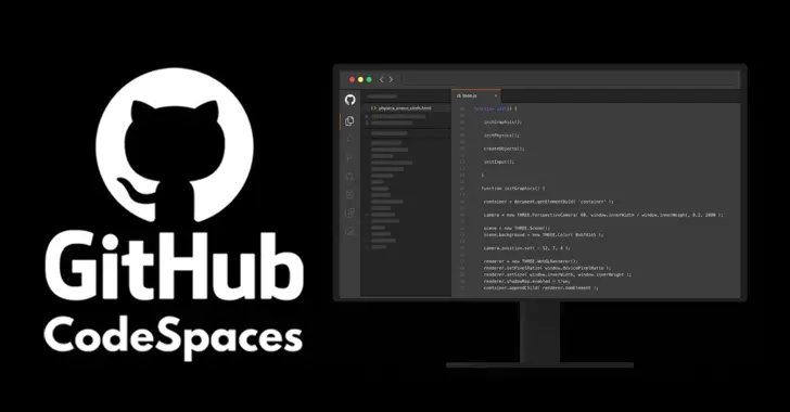
After utilizing web based programming environments/tools like posit cloud, anaconda cloud and google colab, I was excited to read about GitHub Codespaces. I decided to take the GitHub Codespaces for Students course and was not disappointed. It was definitely a quick crash course but it was super helpful, insightful and very hands-on. I can definitely see how this can be another option going forward and helpful for easing the process of getting some of my projects put up on github and updating that work. This particular course introduced me to the student GitHub Pro discount and the GitHub Student Developer Pack. Apart from introducing me to GitHub Codespaces, I also got a quick introduction to dev containers and their importance and use when utilizing GitHub Codespaces. It also included a quick hands-on project on machine learning with Codespaces!
The course 5340 Discovery and Learning with Big Data seemed to be carrying over a title from a different era because by this time the term “Big Data” isn’t really en vogue anymore. Is there any other data now? I think this course could have easily been titled “An Introduction to Machine Learning utilizing Python”. It began with a crash course/review of Python in order to utilize it going forward via a Jupyter notebook environment. Just like posit Cloud was a great resource and tool for learning and utilizing the R programming language in my previous course, this time I discovered Google Colab and I was in love! Unfortunately, we still had to go through all of the Anaconda local installation and environment configuration process for our first assignment. Thankfully, our professor agreed to let us use Anaconda Cloud and Google Colab for the rest of the assignments and classwork. I tried Anaconda Cloud and really wanted to like it. They had great Python courses, etc. However, in the end, Google Colab won out for me.
The crash course in Python at the start of the course consisted of 12 homework assignments/exercises that included programming basics, basic Python data types, data structures (lists, range, strings, tuples, series, dataframes, NumPy arrays). The lectures began with the basics of the data analytics life cycle and exploratory data analysis including data visualization utilizing MatplotLib which I did not care for at all. Just plain ugly. By this time I had already used Plotly for Python, Seaborn, Altair, and Bokeh and preferred any of them over MatPlotLib.
The rest of the course moved rapidly from an introduction to Machine Learning using Python (NumPy, Pandas, SciKIt-Learn) to rapidly covering Supervised Machine Learning (Linear and Logistic Regression, CART & KNN), Unsupervised Machine Learning (KMeans, Anomaly Detection), and the The Azure Machine Learning Studio (a drag and drop, wireframe, no code ML tool).
Tools Utilized: Python (NumPy, Pandas, Scikit-Learn) Jupyter Notebooks, Google Colab, Microsoft Machine Learning Studio (Azure) Skills Acquired/Developed: Data analytics cycle, preprocessing, Exploratory Data Analysis (EDA), Supervised Machine Learning Algorithms, Supervised Non-Linear Algorithms, Unsupervised Algorithms, Evaluating Algorithms
If 5130 Data Analytics 1 seemed like a crash course in basic R and Statistics 101 then 5230 Data Analytics II seemed like a crash course in advanced R and machine learning!
It was intense and the most difficult course I’ve taken in this program. The pace of the class and the professor assumed a strong background in R that I, obviously, did not have. Unfortunately, after attending office hours, etc. I had to hire an R tutor to help explain to me what the code I was copying/pasting was actually doing. I was also even more grateful for Posit.cloud than I had been in my previous course. I used it extensively for this course and really enjoyed the overall experience, the resources it provides and not having to mess with installation rituals, downloads, command line, etc. since it was all web-based and ready to get you to code.
The course was meant to be an extension of of the concepts introduced in Data Analytics I including multivariate analysis, classification methods, association rules, dimension reduction, performance evaluation, multiple and logistic regression, k-Nearest Neighbors (k-NN), Naive Bayes classifier, decision trees, Neural Nets and discriminant analysis. However, the pace was much more rushed and the content much more dense which makes sense since it is DA II but the professor and the structure of the course was not very helpful and I had to rely on a lot of outside support and supplementary materials to get through the class and really grasp many of the concepts in order to successfully complete the assignments.
Tools Utilized: Excel, R statistical programming language, POSIT (web-based R-Studio application) Skills Acquired/Developed: Multivariate and unstructured data analysis, classification methods, association rules, dimension reduction, performance evaluation, multiple and logistic regression, K-Nearest neighbors (k-NN), Naive Bayes classifier, decision trees, Neural Nets and discriminant analysis.
The class 5240 Harvesting, Storing and Retrieving Data began with a section that was a crash course in Big Data (Structured, Unstructured, Semistructured, the 5 V’s of big data (Volume, Variety, Veracity, Velocity, Value), etc.) It quickly pivoted to primarily focusing on utilizing the Google Cloud Platform data analytics (BigQuery) and database (BigTable, Spanner and Cloud SQL) tools.
It was a solid mix of theory and practice. In fact, the midterm consisted of both a theory portion and a hands-on lab portion. It provided an introduction to collecting, storing, managing, retrieving and processing datasets. Techniques for large and small datasets were considered, as both are needed in data science applications. Traditional survey and experimental design principles for data collection as well as script-based programming techniques for large-scale data harvesting from third party sources were covered. Data wrangling methodologies were introduced for cleaning and merging datasets, storing data for later analysis and constructing derived datasets. Various storage and process architectures were introduced with a focus on how approaches depend on applications, data velocity and end users. Emphasizes applications and includes many hands-on projects.
A few of the tasks were particularly overwhelming since I had never utilized the Google Cloud Platform and it was critical to keep tabs of your usage, etc. Although the tools were similar to other data analtyics and data science tools, the proprietary nature of the processes and click throughs to complete a task were sometimes not very intuitive. So, all that to say that there was a bit of a learning curve. However, The professor of the course was super helpful and provided step by step guidance as needed.
Tools Utilized: Google Cloud Platform (BigQuery, Bigtable, Cloud SQL, Cloud Spanner) Skills Acquired: Collect, store, manage, retrieve, process data sets utilizing the Google Cloud Platform.
Now, after completing those two courses–Data Analysis and Knowledge Discovery and Data Visualization and Communication, I have decided to end my brief journey in the Information Science graduate program to pursue a Master of Science in Advanced Data Analytics. My love and interest in the field of information science will remain strong and I will continue to explore this field and its sub-fields any opportunity that I get.
For now, however, I will be taking a break for the Fall. Working as a full time teacher with a child at home only leaves me a few hours in the evenings and weekends for my studies and it hasn’t been easy. I hope I can manage this new challenge. I will begin the new program in the Spring with - Data Analytics 1 and Harvesting, Storage and Retrieval of Data.
After taking the Python for Data Science and AI course this summer, I’ve wondered if I should have at least applied to the Data Science program. However, my lack of background in linear algebra and calculus (or any math for that matter!) was the primary reason that discouraged me from doing so. Instead, I began my journey in the Master of Science program in Information Science this past semester. It is by no means a compromise, since Information Science, Information Organization, Information Architecture have all been strong interests of mine for a very long time now. I chose to pursue the Information Systems concentration; however, the Information Organization and Knowledge Management paths also looked appealing.
According the program’s website, the Information Science program focuses on “the knowledge, theory, and technology dealing with the collection of both traditional and digital information resources, and the user-oriented processes and methods involved in their manipulation, storage, dissemination, publication and retrieval.” I am definitely very interested in the cross-section between data science and information science–when does data become information and vice versa, and how do they relate to each other? I know that in simple terms, data is raw and is then processed in some way to become meaningful information, but I think the difference may be a bit more complex and nuanced(messier?) than that.
One of the two courses (INFO 5000 - Information and Knowledge Professions) that I took was a bit boring and simply introduced the various professions and an overview of careers in the broad area of information science. The second course (INFO 5200 - Information Organization), however, was much more interesting and a bit challenging. At the start of the course, the professor mentioned that many thought that this was ‘just a database’ class and emphasized that this was much more than that. He preferred the use of the term “Information Retrieval System” and stated in his initial lecture that we would be learning about all the processes the go into “…creating a decent information retrieval system” and clarified that what he meant by ‘decent’ was that it would be “usable by the intended users.” We utilized the book, “The Organization of Information” and referenced it throughout the course.
The major and final assignment for the class was the IOP (Information Organization Project). A very helpful part of this course was that we worked on various assignments along the way that would then make up the final project and feedback was provided on each of those sections (drafts 1-4, SWOT Analysis, concept briefing) along the way. However, even with that support, this class was a lot more difficult than I thought. My IOP was an information organization/retrieval system for a UX/UI Design for Web Programmers collection. It was ok, but there was definitely a lot of room for improvement, not just in terms of the work but in my own understanding of the complex details that go into designing an information system like this.
I explored and worked with: Python programming basics (syntax, data types, expressions, variables, string operations, data structures, conditions, loops, functions, objects, classes). Python libraries: Pandas and Numpy using Jupyter Notebooks. Accessed and extracted web-based data by working with REST APIs using requests and performing web scraping with BeautifulSoup.
I also got an opportunity to tinker with creating a repository on Github and then pushing out the changes on the project as we went along. It was intense but kind of fun actually! I’d love to pursue more Python courses in data science and artificial intelligence, however, I don’t think I’m cut out for the graduate program in this field. It requires some heavy math, particularly, a strong understanding of linear algebra and calculus which, unfortunately, I do not have.
I’ve spent the last months going back and forth between data visualization with Tableau and AI assisted coding and development. Beyond the ‘vibes’, I continue to be curious about the AI engineer path and the possibilities that lie there. I realize that some would say that it’s not necessary for it to be an either/or situation. However, if I want to truly develop my skills in either one, splitting my time evenly with both is not going to be effective or a smart use of my limited time.
At this point, I’ve come to the conclusion that pursuing both paths at the same level of commitment prevents me from developing deep expertise in either. When it comes to Tableau, I genuinely enjoy data visualization and the tool itself. That said, its largely proprietary nature gives me pause. Compared to the flexibility of tools like D3, Tableau requires a significant investment in learning click-driven workflows that keep me tightly bound to a single company’s ecosystem. For me, this constraint contributes to an experience that often feels clunky and limiting.
In contrast, the path of AI-assisted development—and potentially AI engineering—offers far greater flexibility and opportunity. My interests in data visualization, design, and user interactivity remain highly relevant and transferable within this path.
I’m beginning to gain clarity on what my focus needs to be moving forward.
I took the data from a previous project (side by side comparison tool) and created a TEA Ratings Directory Tool 21-22 that features an interactive map of all Texas schools with a pop-up displaying each school’s rating information. The tool can by filtered by rating, region, district type and school type.
The grunt work was getting the coordinates for the map loaded and working correctly in Tableau. The great thing about this set up is that now the base map can be reutilized to show other data in the pop-up. The pop-up can also be redesigned to show other charts, visuals, etc.
And now (and for the rest of this semester!), it’s time to focus on my deep learning course (for the next 8 weeks) and the capstone experience for the rest of the semester up to graduation in May!
I’ve been working on the Advanced Data Visualization with Tableau course while taking breaks from 5410 and finally completed it! It is the 6th course in the Tableau Business Intelligence Analyst Professional certificate and I have 2 more to go! It has been a great course and it provided a nice (and fun!) break from the heavier mental work load of 5410. I loved the consistent structure and format in which each chart type was introduced, taught and then modeled. The course covered motion charts, dual-axis charts, gantt charts, bar-in-bar charts, donut charts, funnel charts, waterfall charts, sparkline charts, map layers, lasso/radial selection, and, polygon maps. It was intense but I hope/need to come back and practice these more slowly and create some custom versions of my own after getting through 5410! Speaking of, I got to get back to wrapping that up. Before that, here is one of my favorite chart resources out there on the wild web.
It has been super helpful and will definitely stay at the top of my data viz bookmarks.
My previous data visualization course only briefly introduced us to Tableau because the course was more of a broad overview of data visualization and communication principles in general. It introduced various tools along the way including Excel, PowerBI, Python, and, Tableau. We had the option to use any one of these tools for our various assignments and I mostly stuck with Excel because it was the tool that I was most familiar with when it came to charts, graphs, etc. I did transition to utilizing Plotly for Python for my final project.
So, considering my recent exploration of Tableau, I was excited to find out that this course, Large Data Visualization utilized Tableau as the primary tool. What I loved about this course, however, was that it was not a course simply teaching Tableau. It included lots of hands-on projects along the way, as well as, content on data visualization theory and best practices. It required you to learn and develop your Tableau skills (if you didn’t already have them) in order to complete the projects. The intro modules included a quick overview of data literacy and I was re-introduced to Florence Nightingale, John Snow’s cholera map, and, Edward Tufte’s work by way of the Art of Data Visualization documentary (which was a little dated but still relevant).
I had come across the book, “Storytelling with Data” multiple times before but had not made the time to actually read through it. I was happy to find out that this was a required text. Unlike other required texts in other courses, this book was, fortunately, used extensively throughout the course.
Apart from installing and setting up Tableau, the first assignment consisted of, first, finding and choosing a dataset. I chose the CIRIGHTS data set, which according to the site is the “largest human rights dataset in the world.” This project scores a representative sample of all internationally recognized human rights for all countries of the world covering 40 years. The next part was to compile an accompanying data dictionary for the dataset.
The next module continued with the theory behind the rationale for the use of data visualization (The Why of Data Viz) and an introduction to Tableau Prep. The assignment deliverable required that we demonstrate that we could utilize Tablea Prep for our chosen data set (connect to it, review/implement it’s prep recommendations, and, utilize the Flow pane). The course continued with design and visualization theory utilizing readings and content from the textbook and also utilizing Tableau to begin creating basic and then more advanced charts with our chosen dataset (including getting critique/feedback from others and revising our charts based on that feedback). One of the biggest takeaways from the book for me was how much I was able to understand/grasp the importance of the Gestalt principles when creating data visualizations.
It’s hard not to be enamored by the work of the data visualization pioneer, Florence Nightingale who worked with the sturdy and reliable tools of plain pen and paper in the 1850s. The exquisite detail utilized to address a very specific problem and demonstrate the power of visualization is very impactful. She utilized a mortality diagram (a polar area chart) where each wedge represented a month.
The area of the wedge shows the number of soldiers who died that month. The blue/gray area represented deaths from preventable diseases (due to terrible conditons), the red areas represented deaths from battlefield wounds, and, finally, the black areas represented deaths from other causes. Her core question was, “Why are these men dying?” was the driver and the problem she was trying to address with her visualization. In the 1850s, she knew the power of visualization to communicate an insight powerfully and effectively. She was able to demonstrate to powerful stakeholders that more soldiers were dying from preventable diseases than from battefield wounds countering the belief that most deaths came from wounds. This insight led to changes that had a huge positive impact and difference in mortality (death rates decreased).
I just completed the Data Ecosystem course, the 5th course in the Tableau Business Intelligence Analyst Professional certificate. It covered databases, data warehouses, data lakes, data architecture, data quality, data governance, and data management. Although it was very much an overview of these topics, I enjoyed the course and learned a lot about the “data engineering” side of things. A lot of which was new to me and it’s important that I learn these concepts even if it’s just knowing what it is and why it’s important or what role it plays in the field.
A packed schedule awaits me next semester. I had already postponed 5410 Deployment of Advanced Analytics, and now I’ll be taking another elective, which looks like it will be 5250 Large Data Visualization. Tableau appears to be the required and primary tool. For some reason, I’ve been avoiding truly diving in to this tool.
My interest in D3 and interactive data visualization is still strong, but I have to make some difficult decisions due to time constraints (graduate studies and a full time job!). I’ve enjoyed my venture into Tableau and, although D3 is by far a better tool when it comes to the bespoke interactive options and flexibility, Tableau is quite robust and it is very much an industry standard go-to when it comes to BI options. Up to this point in my data learning journey I’ve been avoiding diving into Tableau due to my plans to eventually really learn and work with D3. However, this upcoming class has now forced me to, at least for now, focus on giving Tableau a very serious exploration, delving into it more deeply than I every have before.
I’ve enjoyed exploring interactive data visualization projects found on sites like The Pudding for years now. I fiddled with Flash and ActionScript (dating myself!?) back in the day and built a few decent projects that I’ll probably never be able to see again. I have .flv and .swf files that are just relics now. I have missed the user interactivity that you could quickly build in Flash/ActionScript and D3/JavaScript seem to be the tools that get you closest to that experience now on the modern web. I had to at least give it a shot. So, I took a semester off from the analytics program to try to develop my javascript skills and explore D3. A steep learning curve was what I heard and it was that and much more.
I started off strong and bought the book, Interactive Data Visualization for the Web and bookmarked Amanda Wattenberger’s, How to learn D3.js site which is super helpful and exquisitely done. It was, no doubt, a learning curve! That much code for a simple bar graph! Nevertheless, I continued. I built a simple bar chart but not much more for now.
I also signed up for the six-week free Javascript Bootcamp via FreeCodeCamp. I went strong for the first few weeks but then other commitments derailed me and I wasn’t sure I was progressing in my D3 journey. I did, however, finally finish the JavaScript Essential Training course!
At this point, I would definitely love to continue my JavaScript and D3 learning journey, however, with a full-time job and a child at home, my time commitment is limited to a few hours in the evenings and weekends. For this reason, I need to prioritize the path where I’ve already made an investment of time and money and get back to my analytics program. Next semester, it’s on to Data Analytics II and Discovery and Learning with Big Data!
My first official classes for the Master of Science program in Advanced Data Analytics begin next semester. So, before jumping into that, I wanted to try to find time to work on developing my javascript skills as a pathway to using D3 for interactive data visualization on the web. I love python but I am definitely not impressed with its data visualization libraries (matplot lib, seaborn, etc.) for several reasons. One, they are not so easily deployed to the web by default, and, second, they’re just not appealing to me in terms of design and user interactivity.
I also bought the book, Eloquent Javascript and started working through it. It started off with the basics of the language (values, types, functions, data structures, objects, classes, etc.) and then moved on the browser (where javascript shines compared to Python), Asynchronous programming, the DOM, and, finally NodeJS. It included several projects along the way that I attempted to tinker with via playcode but didn’t complete anything unique other than copying/pasting code but it was still a nice learning experience.
Unfortunately, this short venture into the JavaScript world will have to wait as I prepare to embark on this new data analytics journey!
An analysis of the AustinISD Texas Education Agency accountability statewide ratings for 2019.
Course Description: Introduces principles and techniques for data visualization for creating meaningful displays of quantitative and qualitative data to facilitate decision-making. Emphasis is placed on the identification of patterns, trends and differences among data sets.
The tools used in the course included Excel, PowerBI, Tableau, Python (MatPlotLib, Seaborn, Plotly) and covered graphic design principles (color, text, interaction, perception), exploratory data analysis, and implementing data visualization techniques through charts and interactive dashboards. To supplement this intro into data visualization, I also completed the Python for Data Visualization and Data Visualization with Plotly courses during this semester. These two courses helped me to utilize Plotly for Python in my final project.
I took the data from a previous project (side by side comparison tool) and created a TEA Ratings Directory Tool 21-22 that features an interactive map of all Texas schools with a pop-up displaying each school’s rating information. The tool can by filtered by rating, region, district type and school type.
The grunt work was getting the coordinates for the map loaded and working correctly in Tableau. The great thing about this set up is that now the base map can be reutilized to show other data in the pop-up. The pop-up can also be redesigned to show other charts, visuals, etc.
I submitted my first draft at the start of April and received quality feedback. I really mean that because this was the first course where the professor met with us one-on-one to provide feedback and discuss our project. It was very valuable and I am grateful for Dr. Quintanar and her support throughout this course. I revised my work and finalized my paper, code and presentation.
My capstone experience project (M.S. Advanced Data Analytics), was an exploration and analysis of Fall 2023 U.S. college enrollment data (115K records, 5,900+ institutions) to uncover demographic patterns and predict graduate enrollment.
Key Findings:
Women consistently outnumber men in enrollment, with the gap widening at the graduate level (60.6% vs. 39.4%).
Hispanic student representation drops sharply from undergrad (25.6%) to graduate (15.2%).
Institutional size distribution is highly skewed (median 588 vs. mean 3,332).
**Models Utilized: Linear Regression, Decision Trees, and Random Forest.
Best performer: Random Forest (R² ≈ 0.78, MAE ~631).
Strongest predictors of graduate enrollment: female enrollment and Asian student representation.
The first major assignment I submitted for our Analytics Capstone Experience was the Concept Paper which includes four sections: Introduction, The Dataset, Research Question, and finally, a discussion of the methodology, tools, and techniques that would be utilized for the analysis. My concept paper outlines an exploration and analysis of a dataset on US college/university enrollment for Fall 2023. The dataset, EF2023A, comes from the IPEDS (Integrated Postsecondary Education System), which is collected by the US Department of Education’s National Center for Education Statistics (NCES).
The project’s goal, as stated in the concept paper, is to analyze and understand enrollment trends, disparities, and the impact of demographic factors on general enrollment.
After this concept paper, the next assignment is a scholarly review, which is due in about two weeks. Considering that I’ve only been taking 8-week courses, this course seems to be going a bit slow, but I need to be careful and not procrastinate or get distracted. Although the first draft is not due until April 4, I need to make sure that I utilize the month of March effectively. Of course, there will be overlap in the first couple of weeks; however, the month of March basically comes down to two weeks to finalize my deep learning course and two weeks to finalize my draft. If I can make significant progress on both or either of these during the first week of March, then I may be able to enjoy Spring Break as some actual ‘break’ time! But, after that, it’ll be time to lock in and wrap up strong. Finally, if all goes well, graduation will be mid-May! That’s the plan.
Final Project for ADTA 5410 Applications and Deployment of Advanced Analytics
Analyze Demographic Factors and Predict College Completion Tools:Python (pandas, scikit-learn, matplotlib), Jupyter Notebook
This project analyzed 2022–2023 college degree completions across 16,000+ U.S. institutions** to uncover the strongest demographic predictors of success.
Key Findings:
Female completions were the most influential factor.
Non-traditional students (ages 25–39) play a critical role in completions.
Random Forest achieved ~99% accuracy, outperforming logistic regression and decision trees.
When I began the Information Science graduate program, I took the course Data Analysis and Knowledge Discovery and it led me to transfer to the Advanced Data Analytics program. The final project for that course was a side by side comparison tool of the 2019 TEA Ratings. It was originally created with Excel using advanced look up functions and formulas, etc. but was then transferred to Google sheets. It functioned well but I couldn’t stop thinking/dreaming about creating a web based version of this tool.
So, a few years after that project and a year after ChatGPT’s debut, I fulfilled that dream! With the assistance of ChatGPT (lots of iterating back and forth and copy/pasting code, etc.), I created that web based version using only html, css, and javascript. Far from perfect but not a bad start!
The course utilized the book Microsoft Excel: Data Analysis and Business Modeling and it was significantly utilized throughout the course. The course began with an introduction to data analysis and then then covered data mining, text mining and knowledge discovery principles, concepts, theories and practices.
For the second part of the course (Text Mining and Classification), the primary tool utilized was RapidMiner. The no code (node based) environment was new and different for me.
My final project for this part of the course was a text analysis of Google’s Python Crash Course Coursera Reviews for the year 2020. The original data set file for this project was obtained from Kaggle and it was collected by Muhmammad Nakhaee. The text analysis techniques utilized for this project were association analysis and cluster (k-means) analysis. Here is the detailed report of the analysis which details the process for both techniques using RapidMiner and the conclusions of the analysis.
Tools Utilized: Excel, RapidMiner Skills Acquired/Developed: Spreadsheet Modeling Basics - Lookup, Index, Match Functions, Pivot Tables, Array Formulas, Charts and Dashboards, Data Mining Basics - Data Prep, Correlation Methods, Association Rules, K-Means Clustering, Discriminant Analysis, k-nearest neighbors, Naive Bayes, Text Mining, Decision Trees, Neural Networks
Apart from that, my interest in data analytics and data science continues to grow so I completed another quick intro/review of the basics – (Learning Data Science: Understanding the Basics). I feel a bit conflicted. I don’t see myself fully in information science but I don’t think I would survive the data science. I’d like to continue to explore working with data but in a more applied path/role.
According to the description in the syllabus for 5410 Applications and Deployment of Advanced Analytics, this course, “…focuses on using advanced analytics in practical case studies to help students develop the skills needed to address complex challenges in industry and business.” The course required the prerequisites of most, if not all, the courses I had taken so far in the program.
The course consisted of 8 modules that began with a crash intro to Python and then moved quickly to ‘Data Exploration and Visualization’ where I explored US College Data using Pandas. Next, we explored a tool called PandasAI with the Titanic dataset and also worked with the process of imputation while doing an exploratory analysis of a west Texas oil fields dataset. All of these assignments required a jupyter notebook with our Python code and a separate pdf written description of the step by step analysis we undertook. For the third assignment of the course we learned about and ran a linear regression of a data set of diamond prices. By this time, I had chosen my data set for my final project and had to submit my research proposal that consisted of the research question, the dataset, the target variable, and, the methodology for the analysis. From here, we explored and used logistic regression using customer acquisition data and then a separate assignment using logistic regression to predict loan default with regularization techniques. Next, we explored Stepwise Regression and Decision Tree models to predict diabetes. The goal was to utilize the diabetes dataset and build two models to predict whether a patient is diabetic based on various health attributes. Next, we used the same dataset but used Random Forest with Hyperparameter Tuning to also predict wheter a patient is diabetic based on various attributes. The course content concluded with an introduction and exploration of neural nets leaving us to finalize and submit our final project.
Final Project: Demographic Factors and College Completion
Tools Utilized: Python, Google Colab, Jupyter Notebooks, GitHub
Skills Acquired: Apply experimental Design, sampling methodologies, parametric and non-parametric tests, linear regression models (analyze, test, improve). Integrate various data analysis techniques and use statistical software tools and programming applications to perform advanced data analysis on a real world project and effectively display the results.
My previous data visualization course only briefly introduced us to Tableau because the course was more of a broad overview of data visualization and communication principles in general. It introduced various tools along the way including Excel, PowerBI, Python, and, Tableau. We had the option to use any one of these tools for our various assignments and I mostly stuck with Excel because it was the tool that I was most familiar with when it came to charts, graphs, etc. I did transition to utilizing Plotly for Python for my final project.
So, considering my recent exploration of Tableau, I was excited to find out that this course, Large Data Visualization utilized Tableau as the primary tool. What I loved about this course, however, was that it was not a course simply teaching Tableau. It included lots of hands-on projects along the way, as well as, content on data visualization theory and best practices. It required you to learn and develop your Tableau skills (if you didn’t already have them) in order to complete the projects. The intro modules included a quick overview of data literacy and I was re-introduced to Florence Nightingale, John Snow’s cholera map, and, Edward Tufte’s work by way of the Art of Data Visualization documentary (which was a little dated but still relevant).
I had come across the book, “Storytelling with Data” multiple times before but had not made the time to actually read through it. I was happy to find out that this was a required text. Unlike other required texts in other courses, this book was, fortunately, used extensively throughout the course.
Apart from installing and setting up Tableau, the first assignment consisted of, first, finding and choosing a dataset. I chose the CIRIGHTS data set, which according to the site is the “largest human rights dataset in the world.” This project scores a representative sample of all internationally recognized human rights for all countries of the world covering 40 years. The next part was to compile an accompanying data dictionary for the dataset.
The next module continued with the theory behind the rationale for the use of data visualization (The Why of Data Viz) and an introduction to Tableau Prep. The assignment deliverable required that we demonstrate that we could utilize Tablea Prep for our chosen data set (connect to it, review/implement it’s prep recommendations, and, utilize the Flow pane). The course continued with design and visualization theory utilizing readings and content from the textbook and also utilizing Tableau to begin creating basic and then more advanced charts with our chosen dataset (including getting critique/feedback from others and revising our charts based on that feedback). One of the biggest takeaways from the book for me was how much I was able to understand/grasp the importance of the Gestalt principles when creating data visualizations.
I recently completed 5130 Data Analytics I which was basically a crash course in basic R and Statistics 101. The professor was a full time data scientiest for Lockheed Martin, so, he definitely took an applied approach throughout the course. The course utilized OpenIntro Statistics as the main textbook. It is open source and had a lot of supplementary resources like videos, slides and labs for each chapter. Although it is not free, these resources definitely make it worth the price and more!
Although we mostly utilized Excel at the start of the course, it soon became my applied introduction to the R programming language! I’m thankful that I discovered Posit.cloud. The site was super helpful and intuitive in getting me working with and learning to work with R. The tutorials and cheat sheets were super helpful and best of all, the cloud based set up gets you to work right away with no complicated set ups, downloads, etc.
The course was an applied overview of quantitative methods essential for analyzing data, with an emphasis on business and industry applications. Topics included identification of appropriate metrics and measurement methods, descriptive and inferential statistics, experimental design, parametric and non-parametric tests, simulation, and linear and logistic regression, categorical data analysis, and select unsupervised learning techniques.
Tools Utilized: Excel, R statistical programming language, POSIT (web-based R-Studio application) Skills Acquired: Basic descriptive and inferential statistics, experimental design, linear/logistic regression, supervised and unsupervised learning techniques
The class 5240 Harvesting, Storing and Retrieving Data began with a section that was a crash course in Big Data (Structured, Unstructured, Semistructured, the 5 V’s of big data (Volume, Variety, Veracity, Velocity, Value), etc.) It quickly pivoted to primarily focusing on utilizing the Google Cloud Platform data analytics (BigQuery) and database (BigTable, Spanner and Cloud SQL) tools.
It was a solid mix of theory and practice. In fact, the midterm consisted of both a theory portion and a hands-on lab portion. It provided an introduction to collecting, storing, managing, retrieving and processing datasets. Techniques for large and small datasets were considered, as both are needed in data science applications. Traditional survey and experimental design principles for data collection as well as script-based programming techniques for large-scale data harvesting from third party sources were covered. Data wrangling methodologies were introduced for cleaning and merging datasets, storing data for later analysis and constructing derived datasets. Various storage and process architectures were introduced with a focus on how approaches depend on applications, data velocity and end users. Emphasizes applications and includes many hands-on projects.
A few of the tasks were particularly overwhelming since I had never utilized the Google Cloud Platform and it was critical to keep tabs of your usage, etc. Although the tools were similar to other data analtyics and data science tools, the proprietary nature of the processes and click throughs to complete a task were sometimes not very intuitive. So, all that to say that there was a bit of a learning curve. However, The professor of the course was super helpful and provided step by step guidance as needed.
Tools Utilized: Google Cloud Platform (BigQuery, Bigtable, Cloud SQL, Cloud Spanner) Skills Acquired: Collect, store, manage, retrieve, process data sets utilizing the Google Cloud Platform.
To supplement and survive my current course, “Data Analysis and Knowledge Discovery” I have undertaken a simultaneous, accelerated, and self-curated crash set of courses in Excel. This class has quickly taught me that I do not actually know Excel like I thought I did!
This self-curated crash set of courses consisted of the following:
My deep dive into data and ai began during the summer of the COVID-19 pandemic (2020). By this time, I had encountered and enjoyed the Zen of Python, but I hadn’t really used the language for building anything more than glorified “hello worlds!” and toy projects. I also had a strong curiosity about data and artificial intelligence.
And so, being stuck at home, I did what I love to do: learn. I enrolled in and completed IBM’s Python for Data Science, AI & Development course that summer. I was a philosophy major and English Language Arts educator venturing into the seemingly foreign world of data science and artificial intelligence. I enjoyed the course but felt that my background (strong in social science and humanities but lacking in mathematics or engineering) prevented me from continuing to pursue data science in any formal fashion.
So, I found a way to get into the master’s chambers, even if it was just for a peek. I had long considered librarians to be the alchemists of information of our time, and now, why not become one? So, instead of data science, I started my graduate program in information science in the Fall of 2020. However, after taking two ‘data’-related courses in the second semester of the program (Data Analysis and Knowledge Discovery and Data Visualization and Communication) and really enjoying them, I decided to transfer to the Advanced Data Analytics program. I considered it to be a path that was a type of ‘applied’ data science (or, at least, for me, a way in the data science door without the strong background in mathematics or engineering.).
First, I received a solid introduction to hugging face via the ‘Working with Hugging Face’ course. Initially, it is very overwhelming to jump in there and see how much open source work is being done in this field. However, it is refreshing to see how many available resources are there for one to pursue and explore.
Both were definitely quick overview courses but they were super helpful and introduced me to a lot of new concepts within this field. I had considered joining Purdue’s program on generative AI or Udacity’s nanodegree in the same field. However, even with Udacity’s current significant discount, I think it’s best to stick to DataCamp and the IBM programs right now. Regardless, the most important thing will be to start building real portfolio projects to make the learning stick.
Up next, is the ‘Developing AI Systems with the OpenAI API which I assume builds on the previous OpenAI API course. During or after this course will be a good time to start brainstorming on potential real world projects that I can start working on.
This is a long way from when I first created the TEA Side by Side Comparison tool way way back in 2023! It covered everything from prompt engineering best practices, strategies, business applications, and chatbot development. Next course is Working with Hugging Face which I’m very excited about since I’ve come across hugging face quite a bit in discussion posts, articles, videos, etc. but I have never used it or known much about it until now. Plus, how can you not love the name and logo of this project!
I’ve spent the last months going back and forth between data visualization with Tableau and AI assisted coding and development. Beyond the ‘vibes’, I continue to be curious about the AI engineer path and the possibilities that lie there. I realize that some would say that it’s not necessary for it to be an either/or situation. However, if I want to truly develop my skills in either one, splitting my time evenly with both is not going to be effective or a smart use of my limited time.
At this point, I’ve come to the conclusion that pursuing both paths at the same level of commitment prevents me from developing deep expertise in either. When it comes to Tableau, I genuinely enjoy data visualization and the tool itself. That said, its largely proprietary nature gives me pause. Compared to the flexibility of tools like D3, Tableau requires a significant investment in learning click-driven workflows that keep me tightly bound to a single company’s ecosystem. For me, this constraint contributes to an experience that often feels clunky and limiting.
In contrast, the path of AI-assisted development—and potentially AI engineering—offers far greater flexibility and opportunity. My interests in data visualization, design, and user interactivity remain highly relevant and transferable within this path.
I’m beginning to gain clarity on what my focus needs to be moving forward.
After an incredible trip to japan, the summer is flying by!
Lately, my thoughts have been racing. I need to focus on finding ways to apply what I learned during my master’s program so I don’t lose touch with the core concepts and processes. To truly build on that foundation, I know I need to apply my skills to real-world projects that solve tangible problems.
While the data field offers many paths, data visualization has consistently been my strongest area of focus. However, after reading “The Rise of the AI Engineer” by Shawn Wang and reflecting on Andrej Karpathy’s quote that “the hottest new programming language is English”, I’ve grown curious–very curious, actually! I’ve listened to swyx previously on JavaScript and Svelte podcasts, but this framing of the “AI Engineer” role is intriguing to me. It’s not only the role of the AI engineer that is intriguing to me but also how it fits with my background and interests. This is not the role of the Machine Learning Engineer–who builds and trains models from scratch. And neither is it the role of the Vibe Coder–using only prompts to build websites and applications and never looking at the code. It’s something else.
So, driven by that curiosity, I decided to embark on DataCamp’s, Associate AI Engineering for Developers specialization! I completed the first course, “Working with the OpenAI API, largely as a way to “kick the tires” a bit and try to understand what this rapidly evolving field is really about–and whether it might be a realistic direction for me to pursue.
At the same time, I also started LinkedIn Learning’s Fundamentals of AI Engineering: Principles and Practical Applications course by Vinoo Ganesh. He offers a particularly insightful take on how this field requires a fundamental shift in mindset:
“One of the most fundamental shifts you’ll experience as you move into the AI engineering ecosystem is the transition from deterministic to probabilistic systems.”
That statement immediately took me back to my probability coursework in 5130 and the discussion I enjoyed on probabilistic thinking–how uncertainty, likelihood, and approximation fundamentally change how we reason about systems. I even bought and read through the book, “The Drunkard’s Walk: How Randomness Rules our Lives” after taking that class.
So, while I could have spent my summer solely building data visualization projects (primarily in Tableau), I found myself exploring a new direction, once again. Is the AI engineer path a genuine and viable trajectory for me, or am I simply chasing another distraction? That’s the question I’ll be working through this coming year.
Considering the deep learning course ended sooner than I anticipated and that progress has been made on my first draft, I think I earned a real break during my Spring Break?!
So, what am I doing with that earned break? Well, I recently read about the term ‘vibe coding’ coined by Andrej Karpathy.
Does this mean that ‘I’ was ‘vibe coding’ when I created (with the assistance of ChatGPT) the TEA School Ratings comparison tool way way back in 2023!? I did have to tweak A LOT of the html, css and javascript that it provided but there’d be no way I would’ve had the skill or time to create it on my own. I did love looking at the overall structure of the code and a lot of the time spent on it was me asking it to explain the rationale behind many of the decisions it was making.
Then, I recently discovered Cursor and I jumped in and took two quick crash courses to help me explore some of it’s features a bit more. There was nothing like this ‘back in the day’ when I created that side by side TEA ratings comparison tool using the og context memory lapse prone ChatGPT! It is refressing and fun to see how fast these tools (and generative AI in general) are moving and improving.
First, I explored the AI Coding Agents with GitHub Copilot and Cursor and then the Accelerate Development with Artificial Intelligence and Cursor course. Both were super short and quick but very helpful. I’ve continued working on some projects here and there but I don’t think I consider myself a ‘vibe coder’ by any means. However, I am definitely very much looking forward to getting back to building some projects in Cursor in the Summer; once I get through this final capstone project. So, for now, I need to focus and lock in because I have to graduate in May!
When I began the Information Science graduate program, I took the course Data Analysis and Knowledge Discovery and it led me to transfer to the Advanced Data Analytics program. The final project for that course was a side by side comparison tool of the 2019 TEA Ratings. It was originally created with Excel using advanced look up functions and formulas, etc. but was then transferred to Google sheets. It functioned well but I couldn’t stop thinking/dreaming about creating a web based version of this tool.
So, a few years after that project and a year after ChatGPT’s debut, I fulfilled that dream! With the assistance of ChatGPT (lots of iterating back and forth and copy/pasting code, etc.), I created that web based version using only html, css, and javascript. Far from perfect but not a bad start!
I’ve taken another break from the Master’s program in Advanced Data Analytics this semester. Data Analytics II was a difficult experience and took a lot out of me. I was close to quitting the program. Even the live tutor I hired wasn’t helping. Not his fault. The pace and amount of R code (and all things Machine Learning) being thrown at me was frustrating and overwhelming. However, the struggle may have helped make the next course more manageable. The professor was also a lot more supportive and better at making abstract concepts more accessible to me. The switch to Python in that class may have also helped.
At about the same time that I started the second course I also started exploring ChatGPT due to all of the buzz. Although it was introduced to the world in November of 2022 I had not really utilized it much in any kind of significant way. I started reading quite a bit about it and then completed the Excel and ChatGPT: Data Analysis Power Tips course on LinkedIn. Chris Dutton’s Excel courses were super helpful to me when I was taking my first Data Analysis course in the Information Science program so I chose to start there. I really enjoyed it and wondered why I waited so long to explore ChatGPT much more intentionally. I then took Ray Villalobos’ “Open AI’s Advanced Data Analytics Intro Course to explore this new option/tool within ChatGPT.
I then ventured out to give a it a try and created my first ChatGPT project utilizing plain ol’ HTML, CSS, and JavaScript (very vanilla). Super simple, I just wanted to create something that worked. I created a Texas School Directory web tool and it wasn’t too bad.
While exploring (but not finishing) Scrimba’s AI-Powered coding course, I created a very simple student raffle/selector app. With the help of ChatGPT I added additional student info (gender and grade level) and then the corresponding visualizations that update dynamically as the students’ information is entered. Super simple but I was hooked!
After utilizing web based programming environments/tools like posit cloud, anaconda cloud and google colab, I was excited to read about GitHub Codespaces. I decided to take the GitHub Codespaces for Students course and was not disappointed. It was definitely a quick crash course but it was super helpful, insightful and very hands-on. I can definitely see how this can be another option going forward and helpful for easing the process of getting some of my projects put up on github and updating that work. This particular course introduced me to the student GitHub Pro discount and the GitHub Student Developer Pack. Apart from introducing me to GitHub Codespaces, I also got a quick introduction to dev containers and their importance and use when utilizing GitHub Codespaces. It also included a quick hands-on project on machine learning with Codespaces!
Although I utilized Git and GitHub for the IBM Python course, it was minimal exposure to the tool. I’ve been wanting to build a more solid understanding of Git and GitHub and version control in general, so, I completed a couple of courses to help me do that. First, I started with Learning Git and GitHub and then, since my focus is currently data analytics and data science, I followed that up with GitHub for Data Scientists. I definitely feel a lot less lost now in the Git and GitHub space and I know this foundation will definitely be useful going forward! Again, just like with Python, I need to find ways to keep using these tools regularly in order to build the muscle memory and not need to keep going back to refreshers.
I’ve enjoyed exploring interactive data visualization projects found on sites like The Pudding for years now. I fiddled with Flash and ActionScript (dating myself!?) back in the day and built a few decent projects that I’ll probably never be able to see again. I have .flv and .swf files that are just relics now. I have missed the user interactivity that you could quickly build in Flash/ActionScript and D3/JavaScript seem to be the tools that get you closest to that experience now on the modern web. I had to at least give it a shot. So, I took a semester off from the analytics program to try to develop my javascript skills and explore D3. A steep learning curve was what I heard and it was that and much more.
I started off strong and bought the book, Interactive Data Visualization for the Web and bookmarked Amanda Wattenberger’s, How to learn D3.js site which is super helpful and exquisitely done. It was, no doubt, a learning curve! That much code for a simple bar graph! Nevertheless, I continued. I built a simple bar chart but not much more for now.
I also signed up for the six-week free Javascript Bootcamp via FreeCodeCamp. I went strong for the first few weeks but then other commitments derailed me and I wasn’t sure I was progressing in my D3 journey. I did, however, finally finish the JavaScript Essential Training course!
At this point, I would definitely love to continue my JavaScript and D3 learning journey, however, with a full-time job and a child at home, my time commitment is limited to a few hours in the evenings and weekends. For this reason, I need to prioritize the path where I’ve already made an investment of time and money and get back to my analytics program. Next semester, it’s on to Data Analytics II and Discovery and Learning with Big Data!
The Python for Data Science and AI course that I completed back in the summer of 2020 (one benefit of pandemic times!) was super helpful and a jumpstart to my interest and pursuit of this data learning/doing path. But, Python, like any other language I assume, is a ‘use it or lose it’ type of thing. It’s easy to forget if you’re not applying it. So, while taking my data visualization course in 2021, I decided to utilize some Python by using Plotly for Python for the data visualizaiton work. At this time, I also completed the Python Quick Start, Python for Students, and the Python for Data Visualization courses.
This semester I felt like I needed another Python refresher, so, I took Python for Non-Programmers. It was my “repeat it all to me like I’m a 5th grader” course and I realized I probably should have taken this prior to the IBM Python course! Then, since I’ve worked a bit with ActionScript (Yep, the flash days!) and JavaScript in the past, I was curious how the two compared and differed, so, I explored that via the Python VS. JavaScript for Development course. A basic foundation seems to be coming along but I have no doubt that I’ll need another Python refresher in the not too distant future if I don’t find ways to keep using the language in hands-on projects.
My first official classes for the Master of Science program in Advanced Data Analytics begin next semester. So, before jumping into that, I wanted to try to find time to work on developing my javascript skills as a pathway to using D3 for interactive data visualization on the web. I love python but I am definitely not impressed with its data visualization libraries (matplot lib, seaborn, etc.) for several reasons. One, they are not so easily deployed to the web by default, and, second, they’re just not appealing to me in terms of design and user interactivity.
I also bought the book, Eloquent Javascript and started working through it. It started off with the basics of the language (values, types, functions, data structures, objects, classes, etc.) and then moved on the browser (where javascript shines compared to Python), Asynchronous programming, the DOM, and, finally NodeJS. It included several projects along the way that I attempted to tinker with via playcode but didn’t complete anything unique other than copying/pasting code but it was still a nice learning experience.
Unfortunately, this short venture into the JavaScript world will have to wait as I prepare to embark on this new data analytics journey!
After an incredible trip to japan, the summer is flying by!
Lately, my thoughts have been racing. I need to focus on finding ways to apply what I learned during my master’s program so I don’t lose touch with the core concepts and processes. To truly build on that foundation, I know I need to apply my skills to real-world projects that solve tangible problems.
While the data field offers many paths, data visualization has consistently been my strongest area of focus. However, after reading “The Rise of the AI Engineer” by Shawn Wang and reflecting on Andrej Karpathy’s quote that “the hottest new programming language is English”, I’ve grown curious–very curious, actually! I’ve listened to swyx previously on JavaScript and Svelte podcasts, but this framing of the “AI Engineer” role is intriguing to me. It’s not only the role of the AI engineer that is intriguing to me but also how it fits with my background and interests. This is not the role of the Machine Learning Engineer–who builds and trains models from scratch. And neither is it the role of the Vibe Coder–using only prompts to build websites and applications and never looking at the code. It’s something else.
So, driven by that curiosity, I decided to embark on DataCamp’s, Associate AI Engineering for Developers specialization! I completed the first course, “Working with the OpenAI API, largely as a way to “kick the tires” a bit and try to understand what this rapidly evolving field is really about–and whether it might be a realistic direction for me to pursue.
At the same time, I also started LinkedIn Learning’s Fundamentals of AI Engineering: Principles and Practical Applications course by Vinoo Ganesh. He offers a particularly insightful take on how this field requires a fundamental shift in mindset:
“One of the most fundamental shifts you’ll experience as you move into the AI engineering ecosystem is the transition from deterministic to probabilistic systems.”
That statement immediately took me back to my probability coursework in 5130 and the discussion I enjoyed on probabilistic thinking–how uncertainty, likelihood, and approximation fundamentally change how we reason about systems. I even bought and read through the book, “The Drunkard’s Walk: How Randomness Rules our Lives” after taking that class.
So, while I could have spent my summer solely building data visualization projects (primarily in Tableau), I found myself exploring a new direction, once again. Is the AI engineer path a genuine and viable trajectory for me, or am I simply chasing another distraction? That’s the question I’ll be working through this coming year.
I submitted my first draft at the start of April and received quality feedback. I really mean that because this was the first course where the professor met with us one-on-one to provide feedback and discuss our project. It was very valuable and I am grateful for Dr. Quintanar and her support throughout this course. I revised my work and finalized my paper, code and presentation.
My capstone experience project (M.S. Advanced Data Analytics), was an exploration and analysis of Fall 2023 U.S. college enrollment data (115K records, 5,900+ institutions) to uncover demographic patterns and predict graduate enrollment.
Key Findings:
Women consistently outnumber men in enrollment, with the gap widening at the graduate level (60.6% vs. 39.4%).
Hispanic student representation drops sharply from undergrad (25.6%) to graduate (15.2%).
Institutional size distribution is highly skewed (median 588 vs. mean 3,332).
**Models Utilized: Linear Regression, Decision Trees, and Random Forest.
Best performer: Random Forest (R² ≈ 0.78, MAE ~631).
Strongest predictors of graduate enrollment: female enrollment and Asian student representation.
Apart from the delays in receiving timely or helpful feedback on grades, this was an excellent course! It provided a solid introduction to foundational deep learning concepts. The practical components were particularly beneficial; at this stage in my journey, the step-by-step guidance provided in the video lectures was exactly what I needed to bridge the gap between theory and application. Utilizing jupyter notebooks via the cloud based Google Colab was super helpful.
Assignment 4: MNIST and Convolutional Neural Networks
This assignment challenged us to build, train, and test a Convolutional Neural Network (CNN) using the MNIST dataset using TensorFlow. While the lectures provided a clear roadmap, implementing the code was rarely simple. It required constant tweaking and troubleshooting to ensure everything functioned correctly. Despite the hurdles, seeing the structure, flow, and internal processes of a model in action was incredibly insightful.
Assignment 5: Comparing Architectures (RNNs and GANs)
This assignment shifted from hands-on coding work toward a conceptual and research based exercise. I produced two reports comparing the CNNs from the previous assignment to Recurrent Neural Networks (RNNs) and Generative Adversarial Networks (GANs).
The distinctions are fascinating:
CNNs vs. RNNs: While CNNs excel at processing spatial correlations—analyzing data in grids from top-to-bottom and left-to-right—RNNs are designed for sequential data. They excel at predicting what comes next in a series, making them ideal for time-series or language tasks.
CNNs vs. GANs: While CNNs are built for detection and classification, GANs focus on creation. They learn patterns from existing data distributions to generate entirely new, realistic data points.
The Final Project: From MNIST to CIFAR-10
The final project extended our work with CNNs by moving from the simple MNIST digits to the more complex CIFAR-10 dataset. This required loading 10 diverse classes of color images, building a new model, and attempting to improve upon its performance.
The contrast in results was a great lesson in data complexity. The MNIST model hit 99% accuracy within just 2,500 steps. In comparison, the CIFAR-10 model only reached 70% accuracy after 10,000 steps. It was a clear demonstration of how dataset sophistication directly impacts model performance and training requirements.
Looking Ahead
This was undoubtedly an intense, fast-paced course, but the exposure to the world of deep learning has been intriguing. It’s definitely a field that I look forward to exploring further. For now, however, it’s time to pivot back to my Capstone Project. Since we wrapped up a bit earlier than expected, I might actually get to enjoy a true break this Spring ‘Break’!
Thankfully, the deep learning course professor graciously allowed us to utilize Google Colab for all of the Jupyter notebook assignments instead of the proposed full week session on setting everything up on GCP (Google Cloud Platform). The course has moved quite rapidly after that first assignment (set up environment and a broad overview of AI/ML/DL). The second assignment included demonstrating the differences and similarities between biological neural netwoks and artificial neural networks. It also required having a basic understanding of linear algebra (matrices, vectors, etc.) and then applying it with several problems. Finally, we were introduced to TensorFlow (an open-source library created by the Google Brain team that is used for large-scale AI machine learning and deep learning projects). The assignment required utilizing basic TensorFlow in a Jupyter notebook (Google Colab). After that assignment, I decided to take a quick crash course on TensorFlow (TensorFlow: Practical Skills in Constructing, Training, and Optimizing Models) to help support my understanding of this library.
For the next assignment we were introduced to Keras (another open-source, user-friendly Python library used for building and experimenting with deep neural networks. It is known for its simplicity and readability.) The assignment required demonstrating an understanding of one-hot encoding and then applying it (using Keras) on the Iris dataset.
Next, we had to design an MLP–fully connected neural network (as had been covered in the lecture material) using Keras on the Iris dataset. We imported libraries, set the seed (ensuring the random process in the code is reproducible in a consistent manner), loaded the data, obtained basic info on the dataset, performed train-test-split, one-hot encoding, ran the model, plotted the results, and, finally, scored the model. I was definitely learning a lot but the bulk of the code was provided to us and there was a lot of support as we went along which was good and helpful (I’d be lost otherwise!). It’s a good starting point but I look forward to continuing to apply these skills to other data sets on my own.
The midterm exam covered both theory (open ended questions demonstrating understanding of the history and the concepts of AI, ML, DL) and application (build, train, and evaluate a deep neural network MLP that has two layers using Keras and the pima diabetes dataset). So for, this course has quickly covered some difficult and heavy concepts and material (linear algebra, artificial neural networks, etc.). It’s an 8 week course on deep learning! I have been very grateful to have NotebookLM to help me summarize and make the material accessible to me in a way that helps me better grasp these concepts and asking as many clarifying questions when I’m not understanding something is super helpful. The most fun has been listening to a podcast of the lecture and materials on my drive to work. It’s helped me review the material several times over. Since the model is only working with the material I upload (class slides, lecture transcripts, etc.) it prevents it from hallucinating, etc. The potential power of something like NotebookLM for all of K-12 education is potentially revolutionary and transformational!
I’ve begun my final stretch for the Master of Science program in Advanced Data Analytics! The ADTA 5940 Analytics Capstone Experience is my first full semester (16 weeks) course since I was in the information science program back in 2020. I’ve also started the semester taking a separate 8 week course at the start of the semester–ADTA 5550 Deep Learning with Big Data.
The capstone experience “requires a significant project about which students periodically report, highlighting the interdisciplinary nature of their findings and its relevance to their interests and/or career goals.” We are required to identify/choose a data set, then developing a problem statement/hypothesis statement, creating a concept paper (1st deliverable), writing a scholarly industry review on the subject of the data set, writing a first draft, revising it and then finalizing the research paper including all of the analysis concluding with a final presentation.
According to the syllabus, the deep learning course “…introduces the fundamentals of artificial neural networks (ANN), the bedrock foundation of the current trend in AI deep learning. The course provides the student with a guide through how to use TensorFlow, the most popular AI framework at present, to build artificial neural networks for deep learning. Besides TensorFlow, Keras, another widely used AI framework that is often used along with TensorFlow in deep-learning projects, will be discussed. The course focuses on the convolutional neural network that has driven the latest breakthroughs in the AI field especially image recognition. This course covers both the theory and the practical implementation of the AI network. As the fundamentals are discussed exemplary AI techniques will be employed to illustrate how AI deep learning theories can be applied to real-world solutions using various programming and system tools.”
There is some pressure since not only am I taking two advanced courses, I am also on my 5th year in the program and I do not think I can extend this any longer after this semester. Yep, just a tad bit nervous, but, here we go!
Final Project for ADTA 5410 Applications and Deployment of Advanced Analytics
Analyze Demographic Factors and Predict College Completion Tools:Python (pandas, scikit-learn, matplotlib), Jupyter Notebook
This project analyzed 2022–2023 college degree completions across 16,000+ U.S. institutions** to uncover the strongest demographic predictors of success.
Key Findings:
Female completions were the most influential factor.
Non-traditional students (ages 25–39) play a critical role in completions.
Random Forest achieved ~99% accuracy, outperforming logistic regression and decision trees.
According to the description in the syllabus for 5410 Applications and Deployment of Advanced Analytics, this course, “…focuses on using advanced analytics in practical case studies to help students develop the skills needed to address complex challenges in industry and business.” The course required the prerequisites of most, if not all, the courses I had taken so far in the program.
The course consisted of 8 modules that began with a crash intro to Python and then moved quickly to ‘Data Exploration and Visualization’ where I explored US College Data using Pandas. Next, we explored a tool called PandasAI with the Titanic dataset and also worked with the process of imputation while doing an exploratory analysis of a west Texas oil fields dataset. All of these assignments required a jupyter notebook with our Python code and a separate pdf written description of the step by step analysis we undertook. For the third assignment of the course we learned about and ran a linear regression of a data set of diamond prices. By this time, I had chosen my data set for my final project and had to submit my research proposal that consisted of the research question, the dataset, the target variable, and, the methodology for the analysis. From here, we explored and used logistic regression using customer acquisition data and then a separate assignment using logistic regression to predict loan default with regularization techniques. Next, we explored Stepwise Regression and Decision Tree models to predict diabetes. The goal was to utilize the diabetes dataset and build two models to predict whether a patient is diabetic based on various health attributes. Next, we used the same dataset but used Random Forest with Hyperparameter Tuning to also predict wheter a patient is diabetic based on various attributes. The course content concluded with an introduction and exploration of neural nets leaving us to finalize and submit our final project.
Final Project: Demographic Factors and College Completion
Tools Utilized: Python, Google Colab, Jupyter Notebooks, GitHub
Skills Acquired: Apply experimental Design, sampling methodologies, parametric and non-parametric tests, linear regression models (analyze, test, improve). Integrate various data analysis techniques and use statistical software tools and programming applications to perform advanced data analysis on a real world project and effectively display the results.
I’ve taken another break from the Master’s program in Advanced Data Analytics this semester. Data Analytics II was a difficult experience and took a lot out of me. I was close to quitting the program. Even the live tutor I hired wasn’t helping. Not his fault. The pace and amount of R code (and all things Machine Learning) being thrown at me was frustrating and overwhelming. However, the struggle may have helped make the next course more manageable. The professor was also a lot more supportive and better at making abstract concepts more accessible to me. The switch to Python in that class may have also helped.
At about the same time that I started the second course I also started exploring ChatGPT due to all of the buzz. Although it was introduced to the world in November of 2022 I had not really utilized it much in any kind of significant way. I started reading quite a bit about it and then completed the Excel and ChatGPT: Data Analysis Power Tips course on LinkedIn. Chris Dutton’s Excel courses were super helpful to me when I was taking my first Data Analysis course in the Information Science program so I chose to start there. I really enjoyed it and wondered why I waited so long to explore ChatGPT much more intentionally. I then took Ray Villalobos’ “Open AI’s Advanced Data Analytics Intro Course to explore this new option/tool within ChatGPT.
I then ventured out to give a it a try and created my first ChatGPT project utilizing plain ol’ HTML, CSS, and JavaScript (very vanilla). Super simple, I just wanted to create something that worked. I created a Texas School Directory web tool and it wasn’t too bad.
While exploring (but not finishing) Scrimba’s AI-Powered coding course, I created a very simple student raffle/selector app. With the help of ChatGPT I added additional student info (gender and grade level) and then the corresponding visualizations that update dynamically as the students’ information is entered. Super simple but I was hooked!
The course 5340 Discovery and Learning with Big Data seemed to be carrying over a title from a different era because by this time the term “Big Data” isn’t really en vogue anymore. Is there any other data now? I think this course could have easily been titled “An Introduction to Machine Learning utilizing Python”. It began with a crash course/review of Python in order to utilize it going forward via a Jupyter notebook environment. Just like posit Cloud was a great resource and tool for learning and utilizing the R programming language in my previous course, this time I discovered Google Colab and I was in love! Unfortunately, we still had to go through all of the Anaconda local installation and environment configuration process for our first assignment. Thankfully, our professor agreed to let us use Anaconda Cloud and Google Colab for the rest of the assignments and classwork. I tried Anaconda Cloud and really wanted to like it. They had great Python courses, etc. However, in the end, Google Colab won out for me.
The crash course in Python at the start of the course consisted of 12 homework assignments/exercises that included programming basics, basic Python data types, data structures (lists, range, strings, tuples, series, dataframes, NumPy arrays). The lectures began with the basics of the data analytics life cycle and exploratory data analysis including data visualization utilizing MatplotLib which I did not care for at all. Just plain ugly. By this time I had already used Plotly for Python, Seaborn, Altair, and Bokeh and preferred any of them over MatPlotLib.
The rest of the course moved rapidly from an introduction to Machine Learning using Python (NumPy, Pandas, SciKIt-Learn) to rapidly covering Supervised Machine Learning (Linear and Logistic Regression, CART & KNN), Unsupervised Machine Learning (KMeans, Anomaly Detection), and the The Azure Machine Learning Studio (a drag and drop, wireframe, no code ML tool).
Tools Utilized: Python (NumPy, Pandas, Scikit-Learn) Jupyter Notebooks, Google Colab, Microsoft Machine Learning Studio (Azure) Skills Acquired/Developed: Data analytics cycle, preprocessing, Exploratory Data Analysis (EDA), Supervised Machine Learning Algorithms, Supervised Non-Linear Algorithms, Unsupervised Algorithms, Evaluating Algorithms
If 5130 Data Analytics 1 seemed like a crash course in basic R and Statistics 101 then 5230 Data Analytics II seemed like a crash course in advanced R and machine learning!
It was intense and the most difficult course I’ve taken in this program. The pace of the class and the professor assumed a strong background in R that I, obviously, did not have. Unfortunately, after attending office hours, etc. I had to hire an R tutor to help explain to me what the code I was copying/pasting was actually doing. I was also even more grateful for Posit.cloud than I had been in my previous course. I used it extensively for this course and really enjoyed the overall experience, the resources it provides and not having to mess with installation rituals, downloads, command line, etc. since it was all web-based and ready to get you to code.
The course was meant to be an extension of of the concepts introduced in Data Analytics I including multivariate analysis, classification methods, association rules, dimension reduction, performance evaluation, multiple and logistic regression, k-Nearest Neighbors (k-NN), Naive Bayes classifier, decision trees, Neural Nets and discriminant analysis. However, the pace was much more rushed and the content much more dense which makes sense since it is DA II but the professor and the structure of the course was not very helpful and I had to rely on a lot of outside support and supplementary materials to get through the class and really grasp many of the concepts in order to successfully complete the assignments.
Tools Utilized: Excel, R statistical programming language, POSIT (web-based R-Studio application) Skills Acquired/Developed: Multivariate and unstructured data analysis, classification methods, association rules, dimension reduction, performance evaluation, multiple and logistic regression, K-Nearest neighbors (k-NN), Naive Bayes classifier, decision trees, Neural Nets and discriminant analysis.
I explored and worked with: Python programming basics (syntax, data types, expressions, variables, string operations, data structures, conditions, loops, functions, objects, classes). Python libraries: Pandas and Numpy using Jupyter Notebooks. Accessed and extracted web-based data by working with REST APIs using requests and performing web scraping with BeautifulSoup.
I also got an opportunity to tinker with creating a repository on Github and then pushing out the changes on the project as we went along. It was intense but kind of fun actually! I’d love to pursue more Python courses in data science and artificial intelligence, however, I don’t think I’m cut out for the graduate program in this field. It requires some heavy math, particularly, a strong understanding of linear algebra and calculus which, unfortunately, I do not have.
This is a long way from when I first created the TEA Side by Side Comparison tool way way back in 2023! It covered everything from prompt engineering best practices, strategies, business applications, and chatbot development. Next course is Working with Hugging Face which I’m very excited about since I’ve come across hugging face quite a bit in discussion posts, articles, videos, etc. but I have never used it or known much about it until now. Plus, how can you not love the name and logo of this project!
An analysis of the AustinISD Texas Education Agency accountability statewide ratings for 2019.
Course Description: Introduces principles and techniques for data visualization for creating meaningful displays of quantitative and qualitative data to facilitate decision-making. Emphasis is placed on the identification of patterns, trends and differences among data sets.
The tools used in the course included Excel, PowerBI, Tableau, Python (MatPlotLib, Seaborn, Plotly) and covered graphic design principles (color, text, interaction, perception), exploratory data analysis, and implementing data visualization techniques through charts and interactive dashboards. To supplement this intro into data visualization, I also completed the Python for Data Visualization and Data Visualization with Plotly courses during this semester. These two courses helped me to utilize Plotly for Python in my final project.
The course utilized the book Microsoft Excel: Data Analysis and Business Modeling and it was significantly utilized throughout the course. The course began with an introduction to data analysis and then then covered data mining, text mining and knowledge discovery principles, concepts, theories and practices.
For the second part of the course (Text Mining and Classification), the primary tool utilized was RapidMiner. The no code (node based) environment was new and different for me.
My final project for this part of the course was a text analysis of Google’s Python Crash Course Coursera Reviews for the year 2020. The original data set file for this project was obtained from Kaggle and it was collected by Muhmammad Nakhaee. The text analysis techniques utilized for this project were association analysis and cluster (k-means) analysis. Here is the detailed report of the analysis which details the process for both techniques using RapidMiner and the conclusions of the analysis.
Tools Utilized: Excel, RapidMiner Skills Acquired/Developed: Spreadsheet Modeling Basics - Lookup, Index, Match Functions, Pivot Tables, Array Formulas, Charts and Dashboards, Data Mining Basics - Data Prep, Correlation Methods, Association Rules, K-Means Clustering, Discriminant Analysis, k-nearest neighbors, Naive Bayes, Text Mining, Decision Trees, Neural Networks
Apart from that, my interest in data analytics and data science continues to grow so I completed another quick intro/review of the basics – (Learning Data Science: Understanding the Basics). I feel a bit conflicted. I don’t see myself fully in information science but I don’t think I would survive the data science. I’d like to continue to explore working with data but in a more applied path/role.
My deep dive into data and ai began during the summer of the COVID-19 pandemic (2020). By this time, I had encountered and enjoyed the Zen of Python, but I hadn’t really used the language for building anything more than glorified “hello worlds!” and toy projects. I also had a strong curiosity about data and artificial intelligence.
And so, being stuck at home, I did what I love to do: learn. I enrolled in and completed IBM’s Python for Data Science, AI & Development course that summer. I was a philosophy major and English Language Arts educator venturing into the seemingly foreign world of data science and artificial intelligence. I enjoyed the course but felt that my background (strong in social science and humanities but lacking in mathematics or engineering) prevented me from continuing to pursue data science in any formal fashion.
So, I found a way to get into the master’s chambers, even if it was just for a peek. I had long considered librarians to be the alchemists of information of our time, and now, why not become one? So, instead of data science, I started my graduate program in information science in the Fall of 2020. However, after taking two ‘data’-related courses in the second semester of the program (Data Analysis and Knowledge Discovery and Data Visualization and Communication) and really enjoying them, I decided to transfer to the Advanced Data Analytics program. I considered it to be a path that was a type of ‘applied’ data science (or, at least, for me, a way in the data science door without the strong background in mathematics or engineering.).
First, I received a solid introduction to hugging face via the ‘Working with Hugging Face’ course. Initially, it is very overwhelming to jump in there and see how much open source work is being done in this field. However, it is refreshing to see how many available resources are there for one to pursue and explore.
Both were definitely quick overview courses but they were super helpful and introduced me to a lot of new concepts within this field. I had considered joining Purdue’s program on generative AI or Udacity’s nanodegree in the same field. However, even with Udacity’s current significant discount, I think it’s best to stick to DataCamp and the IBM programs right now. Regardless, the most important thing will be to start building real portfolio projects to make the learning stick.
Up next, is the ‘Developing AI Systems with the OpenAI API which I assume builds on the previous OpenAI API course. During or after this course will be a good time to start brainstorming on potential real world projects that I can start working on.
This is a long way from when I first created the TEA Side by Side Comparison tool way way back in 2023! It covered everything from prompt engineering best practices, strategies, business applications, and chatbot development. Next course is Working with Hugging Face which I’m very excited about since I’ve come across hugging face quite a bit in discussion posts, articles, videos, etc. but I have never used it or known much about it until now. Plus, how can you not love the name and logo of this project!
After an incredible trip to japan, the summer is flying by!
Lately, my thoughts have been racing. I need to focus on finding ways to apply what I learned during my master’s program so I don’t lose touch with the core concepts and processes. To truly build on that foundation, I know I need to apply my skills to real-world projects that solve tangible problems.
While the data field offers many paths, data visualization has consistently been my strongest area of focus. However, after reading “The Rise of the AI Engineer” by Shawn Wang and reflecting on Andrej Karpathy’s quote that “the hottest new programming language is English”, I’ve grown curious–very curious, actually! I’ve listened to swyx previously on JavaScript and Svelte podcasts, but this framing of the “AI Engineer” role is intriguing to me. It’s not only the role of the AI engineer that is intriguing to me but also how it fits with my background and interests. This is not the role of the Machine Learning Engineer–who builds and trains models from scratch. And neither is it the role of the Vibe Coder–using only prompts to build websites and applications and never looking at the code. It’s something else.
So, driven by that curiosity, I decided to embark on DataCamp’s, Associate AI Engineering for Developers specialization! I completed the first course, “Working with the OpenAI API, largely as a way to “kick the tires” a bit and try to understand what this rapidly evolving field is really about–and whether it might be a realistic direction for me to pursue.
At the same time, I also started LinkedIn Learning’s Fundamentals of AI Engineering: Principles and Practical Applications course by Vinoo Ganesh. He offers a particularly insightful take on how this field requires a fundamental shift in mindset:
“One of the most fundamental shifts you’ll experience as you move into the AI engineering ecosystem is the transition from deterministic to probabilistic systems.”
That statement immediately took me back to my probability coursework in 5130 and the discussion I enjoyed on probabilistic thinking–how uncertainty, likelihood, and approximation fundamentally change how we reason about systems. I even bought and read through the book, “The Drunkard’s Walk: How Randomness Rules our Lives” after taking that class.
So, while I could have spent my summer solely building data visualization projects (primarily in Tableau), I found myself exploring a new direction, once again. Is the AI engineer path a genuine and viable trajectory for me, or am I simply chasing another distraction? That’s the question I’ll be working through this coming year.
Considering the deep learning course ended sooner than I anticipated and that progress has been made on my first draft, I think I earned a real break during my Spring Break?!
So, what am I doing with that earned break? Well, I recently read about the term ‘vibe coding’ coined by Andrej Karpathy.
Does this mean that ‘I’ was ‘vibe coding’ when I created (with the assistance of ChatGPT) the TEA School Ratings comparison tool way way back in 2023!? I did have to tweak A LOT of the html, css and javascript that it provided but there’d be no way I would’ve had the skill or time to create it on my own. I did love looking at the overall structure of the code and a lot of the time spent on it was me asking it to explain the rationale behind many of the decisions it was making.
Then, I recently discovered Cursor and I jumped in and took two quick crash courses to help me explore some of it’s features a bit more. There was nothing like this ‘back in the day’ when I created that side by side TEA ratings comparison tool using the og context memory lapse prone ChatGPT! It is refressing and fun to see how fast these tools (and generative AI in general) are moving and improving.
First, I explored the AI Coding Agents with GitHub Copilot and Cursor and then the Accelerate Development with Artificial Intelligence and Cursor course. Both were super short and quick but very helpful. I’ve continued working on some projects here and there but I don’t think I consider myself a ‘vibe coder’ by any means. However, I am definitely very much looking forward to getting back to building some projects in Cursor in the Summer; once I get through this final capstone project. So, for now, I need to focus and lock in because I have to graduate in May!
Unfortunately, due to various personal and work conflicts, I had to postpone 5410 Deployment of Advanced Analytics until next semester. Knowing that it will be Python heavy, I decided to brush up and prepare by completing the Introduction to Python for Developers and the Intermediate Python courses on Datacamp. I’m beginning to feel a lot more confident with Python where instead of just copying code, I’m able to read it now and edit it as needed. Definitely not fluent but a lot more comfortable with reading and revising it as needed. Apart from that, I also completed the Prompt Engineering: How to Talk to the AIs course on LinkedIn Learning to explore some best practices, strategies and examples of good prompt engineering.
I’ve taken another break from the Master’s program in Advanced Data Analytics this semester. Data Analytics II was a difficult experience and took a lot out of me. I was close to quitting the program. Even the live tutor I hired wasn’t helping. Not his fault. The pace and amount of R code (and all things Machine Learning) being thrown at me was frustrating and overwhelming. However, the struggle may have helped make the next course more manageable. The professor was also a lot more supportive and better at making abstract concepts more accessible to me. The switch to Python in that class may have also helped.
At about the same time that I started the second course I also started exploring ChatGPT due to all of the buzz. Although it was introduced to the world in November of 2022 I had not really utilized it much in any kind of significant way. I started reading quite a bit about it and then completed the Excel and ChatGPT: Data Analysis Power Tips course on LinkedIn. Chris Dutton’s Excel courses were super helpful to me when I was taking my first Data Analysis course in the Information Science program so I chose to start there. I really enjoyed it and wondered why I waited so long to explore ChatGPT much more intentionally. I then took Ray Villalobos’ “Open AI’s Advanced Data Analytics Intro Course to explore this new option/tool within ChatGPT.
I then ventured out to give a it a try and created my first ChatGPT project utilizing plain ol’ HTML, CSS, and JavaScript (very vanilla). Super simple, I just wanted to create something that worked. I created a Texas School Directory web tool and it wasn’t too bad.
While exploring (but not finishing) Scrimba’s AI-Powered coding course, I created a very simple student raffle/selector app. With the help of ChatGPT I added additional student info (gender and grade level) and then the corresponding visualizations that update dynamically as the students’ information is entered. Super simple but I was hooked!
Final Project for ADTA 5410 Applications and Deployment of Advanced Analytics
Analyze Demographic Factors and Predict College Completion Tools:Python (pandas, scikit-learn, matplotlib), Jupyter Notebook
This project analyzed 2022–2023 college degree completions across 16,000+ U.S. institutions** to uncover the strongest demographic predictors of success.
Key Findings:
Female completions were the most influential factor.
Non-traditional students (ages 25–39) play a critical role in completions.
Random Forest achieved ~99% accuracy, outperforming logistic regression and decision trees.
According to the description in the syllabus for 5410 Applications and Deployment of Advanced Analytics, this course, “…focuses on using advanced analytics in practical case studies to help students develop the skills needed to address complex challenges in industry and business.” The course required the prerequisites of most, if not all, the courses I had taken so far in the program.
The course consisted of 8 modules that began with a crash intro to Python and then moved quickly to ‘Data Exploration and Visualization’ where I explored US College Data using Pandas. Next, we explored a tool called PandasAI with the Titanic dataset and also worked with the process of imputation while doing an exploratory analysis of a west Texas oil fields dataset. All of these assignments required a jupyter notebook with our Python code and a separate pdf written description of the step by step analysis we undertook. For the third assignment of the course we learned about and ran a linear regression of a data set of diamond prices. By this time, I had chosen my data set for my final project and had to submit my research proposal that consisted of the research question, the dataset, the target variable, and, the methodology for the analysis. From here, we explored and used logistic regression using customer acquisition data and then a separate assignment using logistic regression to predict loan default with regularization techniques. Next, we explored Stepwise Regression and Decision Tree models to predict diabetes. The goal was to utilize the diabetes dataset and build two models to predict whether a patient is diabetic based on various health attributes. Next, we used the same dataset but used Random Forest with Hyperparameter Tuning to also predict wheter a patient is diabetic based on various attributes. The course content concluded with an introduction and exploration of neural nets leaving us to finalize and submit our final project.
Final Project: Demographic Factors and College Completion
Tools Utilized: Python, Google Colab, Jupyter Notebooks, GitHub
Skills Acquired: Apply experimental Design, sampling methodologies, parametric and non-parametric tests, linear regression models (analyze, test, improve). Integrate various data analysis techniques and use statistical software tools and programming applications to perform advanced data analysis on a real world project and effectively display the results.
Unfortunately, due to various personal and work conflicts, I had to postpone 5410 Deployment of Advanced Analytics until next semester. Knowing that it will be Python heavy, I decided to brush up and prepare by completing the Introduction to Python for Developers and the Intermediate Python courses on Datacamp. I’m beginning to feel a lot more confident with Python where instead of just copying code, I’m able to read it now and edit it as needed. Definitely not fluent but a lot more comfortable with reading and revising it as needed. Apart from that, I also completed the Prompt Engineering: How to Talk to the AIs course on LinkedIn Learning to explore some best practices, strategies and examples of good prompt engineering.
Knowing that I only have a few courses to go before I graduate makes me both excited and quite a bit nervous. Instead of taking 2 (8 week) courses this semester I will only be taking 1 (5410 Deployment of Advanced Analytics) and it will start in March. The professor shared an old 8 week syllabus with me and stated that the main adjustment is that the course will be in Python and not in R. I have been trying to improve my R skills via the Posit tutorials and others but I may have to switch gears. The professor’s rationale in the e-mail response makes sense. Python has won out in this space and it makes sense to prepare students with the tools where more jobs are available. He did recommend that I prepare by going to the Statlearning site and reviewing the material there. The site and resources reminds me a lot of the OpenStatistics companion site and how helpful the set up and the resources were. The other positive about this text and site is that it offers both applications in R and Python.
Anticipating this move from R to Python in the program, I went back for another Python refresher and completed the Intro to Python course on Datacamp and the new 2023 version of the Python Quick Start course on LinkedIn. I had previously completed the 2019 release in 2021. I also completed the overview Introduction to Data Science ‘crash’ course (2 hours) by Madecraft on LinkedIn Learning.
Also, considering my lack of interest in Python’s data visualization tools and that D3 requires a time intensive commitment (that’s definitely not feasible right now with what’s on my my plate) I’m moving towards exploring Tableau as my data visualization tool. So, I completed the Introduction to Tableau course also on DataCamp and it is definitely a tool that I want to keep exploring.
The course 5340 Discovery and Learning with Big Data seemed to be carrying over a title from a different era because by this time the term “Big Data” isn’t really en vogue anymore. Is there any other data now? I think this course could have easily been titled “An Introduction to Machine Learning utilizing Python”. It began with a crash course/review of Python in order to utilize it going forward via a Jupyter notebook environment. Just like posit Cloud was a great resource and tool for learning and utilizing the R programming language in my previous course, this time I discovered Google Colab and I was in love! Unfortunately, we still had to go through all of the Anaconda local installation and environment configuration process for our first assignment. Thankfully, our professor agreed to let us use Anaconda Cloud and Google Colab for the rest of the assignments and classwork. I tried Anaconda Cloud and really wanted to like it. They had great Python courses, etc. However, in the end, Google Colab won out for me.
The crash course in Python at the start of the course consisted of 12 homework assignments/exercises that included programming basics, basic Python data types, data structures (lists, range, strings, tuples, series, dataframes, NumPy arrays). The lectures began with the basics of the data analytics life cycle and exploratory data analysis including data visualization utilizing MatplotLib which I did not care for at all. Just plain ugly. By this time I had already used Plotly for Python, Seaborn, Altair, and Bokeh and preferred any of them over MatPlotLib.
The rest of the course moved rapidly from an introduction to Machine Learning using Python (NumPy, Pandas, SciKIt-Learn) to rapidly covering Supervised Machine Learning (Linear and Logistic Regression, CART & KNN), Unsupervised Machine Learning (KMeans, Anomaly Detection), and the The Azure Machine Learning Studio (a drag and drop, wireframe, no code ML tool).
Tools Utilized: Python (NumPy, Pandas, Scikit-Learn) Jupyter Notebooks, Google Colab, Microsoft Machine Learning Studio (Azure) Skills Acquired/Developed: Data analytics cycle, preprocessing, Exploratory Data Analysis (EDA), Supervised Machine Learning Algorithms, Supervised Non-Linear Algorithms, Unsupervised Algorithms, Evaluating Algorithms
The Python for Data Science and AI course that I completed back in the summer of 2020 (one benefit of pandemic times!) was super helpful and a jumpstart to my interest and pursuit of this data learning/doing path. But, Python, like any other language I assume, is a ‘use it or lose it’ type of thing. It’s easy to forget if you’re not applying it. So, while taking my data visualization course in 2021, I decided to utilize some Python by using Plotly for Python for the data visualizaiton work. At this time, I also completed the Python Quick Start, Python for Students, and the Python for Data Visualization courses.
This semester I felt like I needed another Python refresher, so, I took Python for Non-Programmers. It was my “repeat it all to me like I’m a 5th grader” course and I realized I probably should have taken this prior to the IBM Python course! Then, since I’ve worked a bit with ActionScript (Yep, the flash days!) and JavaScript in the past, I was curious how the two compared and differed, so, I explored that via the Python VS. JavaScript for Development course. A basic foundation seems to be coming along but I have no doubt that I’ll need another Python refresher in the not too distant future if I don’t find ways to keep using the language in hands-on projects.
An analysis of the AustinISD Texas Education Agency accountability statewide ratings for 2019.
Course Description: Introduces principles and techniques for data visualization for creating meaningful displays of quantitative and qualitative data to facilitate decision-making. Emphasis is placed on the identification of patterns, trends and differences among data sets.
The tools used in the course included Excel, PowerBI, Tableau, Python (MatPlotLib, Seaborn, Plotly) and covered graphic design principles (color, text, interaction, perception), exploratory data analysis, and implementing data visualization techniques through charts and interactive dashboards. To supplement this intro into data visualization, I also completed the Python for Data Visualization and Data Visualization with Plotly courses during this semester. These two courses helped me to utilize Plotly for Python in my final project.
I explored and worked with: Python programming basics (syntax, data types, expressions, variables, string operations, data structures, conditions, loops, functions, objects, classes). Python libraries: Pandas and Numpy using Jupyter Notebooks. Accessed and extracted web-based data by working with REST APIs using requests and performing web scraping with BeautifulSoup.
I also got an opportunity to tinker with creating a repository on Github and then pushing out the changes on the project as we went along. It was intense but kind of fun actually! I’d love to pursue more Python courses in data science and artificial intelligence, however, I don’t think I’m cut out for the graduate program in this field. It requires some heavy math, particularly, a strong understanding of linear algebra and calculus which, unfortunately, I do not have.
Knowing that I only have a few courses to go before I graduate makes me both excited and quite a bit nervous. Instead of taking 2 (8 week) courses this semester I will only be taking 1 (5410 Deployment of Advanced Analytics) and it will start in March. The professor shared an old 8 week syllabus with me and stated that the main adjustment is that the course will be in Python and not in R. I have been trying to improve my R skills via the Posit tutorials and others but I may have to switch gears. The professor’s rationale in the e-mail response makes sense. Python has won out in this space and it makes sense to prepare students with the tools where more jobs are available. He did recommend that I prepare by going to the Statlearning site and reviewing the material there. The site and resources reminds me a lot of the OpenStatistics companion site and how helpful the set up and the resources were. The other positive about this text and site is that it offers both applications in R and Python.
Anticipating this move from R to Python in the program, I went back for another Python refresher and completed the Intro to Python course on Datacamp and the new 2023 version of the Python Quick Start course on LinkedIn. I had previously completed the 2019 release in 2021. I also completed the overview Introduction to Data Science ‘crash’ course (2 hours) by Madecraft on LinkedIn Learning.
Also, considering my lack of interest in Python’s data visualization tools and that D3 requires a time intensive commitment (that’s definitely not feasible right now with what’s on my my plate) I’m moving towards exploring Tableau as my data visualization tool. So, I completed the Introduction to Tableau course also on DataCamp and it is definitely a tool that I want to keep exploring.
If 5130 Data Analytics 1 seemed like a crash course in basic R and Statistics 101 then 5230 Data Analytics II seemed like a crash course in advanced R and machine learning!
It was intense and the most difficult course I’ve taken in this program. The pace of the class and the professor assumed a strong background in R that I, obviously, did not have. Unfortunately, after attending office hours, etc. I had to hire an R tutor to help explain to me what the code I was copying/pasting was actually doing. I was also even more grateful for Posit.cloud than I had been in my previous course. I used it extensively for this course and really enjoyed the overall experience, the resources it provides and not having to mess with installation rituals, downloads, command line, etc. since it was all web-based and ready to get you to code.
The course was meant to be an extension of of the concepts introduced in Data Analytics I including multivariate analysis, classification methods, association rules, dimension reduction, performance evaluation, multiple and logistic regression, k-Nearest Neighbors (k-NN), Naive Bayes classifier, decision trees, Neural Nets and discriminant analysis. However, the pace was much more rushed and the content much more dense which makes sense since it is DA II but the professor and the structure of the course was not very helpful and I had to rely on a lot of outside support and supplementary materials to get through the class and really grasp many of the concepts in order to successfully complete the assignments.
Tools Utilized: Excel, R statistical programming language, POSIT (web-based R-Studio application) Skills Acquired/Developed: Multivariate and unstructured data analysis, classification methods, association rules, dimension reduction, performance evaluation, multiple and logistic regression, K-Nearest neighbors (k-NN), Naive Bayes classifier, decision trees, Neural Nets and discriminant analysis.
I recently completed 5130 Data Analytics I which was basically a crash course in basic R and Statistics 101. The professor was a full time data scientiest for Lockheed Martin, so, he definitely took an applied approach throughout the course. The course utilized OpenIntro Statistics as the main textbook. It is open source and had a lot of supplementary resources like videos, slides and labs for each chapter. Although it is not free, these resources definitely make it worth the price and more!
Although we mostly utilized Excel at the start of the course, it soon became my applied introduction to the R programming language! I’m thankful that I discovered Posit.cloud. The site was super helpful and intuitive in getting me working with and learning to work with R. The tutorials and cheat sheets were super helpful and best of all, the cloud based set up gets you to work right away with no complicated set ups, downloads, etc.
The course was an applied overview of quantitative methods essential for analyzing data, with an emphasis on business and industry applications. Topics included identification of appropriate metrics and measurement methods, descriptive and inferential statistics, experimental design, parametric and non-parametric tests, simulation, and linear and logistic regression, categorical data analysis, and select unsupervised learning techniques.
Tools Utilized: Excel, R statistical programming language, POSIT (web-based R-Studio application) Skills Acquired: Basic descriptive and inferential statistics, experimental design, linear/logistic regression, supervised and unsupervised learning techniques
The class 5240 Harvesting, Storing and Retrieving Data began with a section that was a crash course in Big Data (Structured, Unstructured, Semistructured, the 5 V’s of big data (Volume, Variety, Veracity, Velocity, Value), etc.) It quickly pivoted to primarily focusing on utilizing the Google Cloud Platform data analytics (BigQuery) and database (BigTable, Spanner and Cloud SQL) tools.
It was a solid mix of theory and practice. In fact, the midterm consisted of both a theory portion and a hands-on lab portion. It provided an introduction to collecting, storing, managing, retrieving and processing datasets. Techniques for large and small datasets were considered, as both are needed in data science applications. Traditional survey and experimental design principles for data collection as well as script-based programming techniques for large-scale data harvesting from third party sources were covered. Data wrangling methodologies were introduced for cleaning and merging datasets, storing data for later analysis and constructing derived datasets. Various storage and process architectures were introduced with a focus on how approaches depend on applications, data velocity and end users. Emphasizes applications and includes many hands-on projects.
A few of the tasks were particularly overwhelming since I had never utilized the Google Cloud Platform and it was critical to keep tabs of your usage, etc. Although the tools were similar to other data analtyics and data science tools, the proprietary nature of the processes and click throughs to complete a task were sometimes not very intuitive. So, all that to say that there was a bit of a learning curve. However, The professor of the course was super helpful and provided step by step guidance as needed.
Tools Utilized: Google Cloud Platform (BigQuery, Bigtable, Cloud SQL, Cloud Spanner) Skills Acquired: Collect, store, manage, retrieve, process data sets utilizing the Google Cloud Platform.
I’ve spent the last months going back and forth between data visualization with Tableau and AI assisted coding and development. Beyond the ‘vibes’, I continue to be curious about the AI engineer path and the possibilities that lie there. I realize that some would say that it’s not necessary for it to be an either/or situation. However, if I want to truly develop my skills in either one, splitting my time evenly with both is not going to be effective or a smart use of my limited time.
At this point, I’ve come to the conclusion that pursuing both paths at the same level of commitment prevents me from developing deep expertise in either. When it comes to Tableau, I genuinely enjoy data visualization and the tool itself. That said, its largely proprietary nature gives me pause. Compared to the flexibility of tools like D3, Tableau requires a significant investment in learning click-driven workflows that keep me tightly bound to a single company’s ecosystem. For me, this constraint contributes to an experience that often feels clunky and limiting.
In contrast, the path of AI-assisted development—and potentially AI engineering—offers far greater flexibility and opportunity. My interests in data visualization, design, and user interactivity remain highly relevant and transferable within this path.
I’m beginning to gain clarity on what my focus needs to be moving forward.
I took the data from a previous project (side by side comparison tool) and created a TEA Ratings Directory Tool 21-22 that features an interactive map of all Texas schools with a pop-up displaying each school’s rating information. The tool can by filtered by rating, region, district type and school type.
The grunt work was getting the coordinates for the map loaded and working correctly in Tableau. The great thing about this set up is that now the base map can be reutilized to show other data in the pop-up. The pop-up can also be redesigned to show other charts, visuals, etc.
And now (and for the rest of this semester!), it’s time to focus on my deep learning course (for the next 8 weeks) and the capstone experience for the rest of the semester up to graduation in May!
I’ve been working on the Advanced Data Visualization with Tableau course while taking breaks from 5410 and finally completed it! It is the 6th course in the Tableau Business Intelligence Analyst Professional certificate and I have 2 more to go! It has been a great course and it provided a nice (and fun!) break from the heavier mental work load of 5410. I loved the consistent structure and format in which each chart type was introduced, taught and then modeled. The course covered motion charts, dual-axis charts, gantt charts, bar-in-bar charts, donut charts, funnel charts, waterfall charts, sparkline charts, map layers, lasso/radial selection, and, polygon maps. It was intense but I hope/need to come back and practice these more slowly and create some custom versions of my own after getting through 5410! Speaking of, I got to get back to wrapping that up. Before that, here is one of my favorite chart resources out there on the wild web.
It has been super helpful and will definitely stay at the top of my data viz bookmarks.
I just completed the Data Ecosystem course, the 5th course in the Tableau Business Intelligence Analyst Professional certificate. It covered databases, data warehouses, data lakes, data architecture, data quality, data governance, and data management. Although it was very much an overview of these topics, I enjoyed the course and learned a lot about the “data engineering” side of things. A lot of which was new to me and it’s important that I learn these concepts even if it’s just knowing what it is and why it’s important or what role it plays in the field.
A packed schedule awaits me next semester. I had already postponed 5410 Deployment of Advanced Analytics, and now I’ll be taking another elective, which looks like it will be 5250 Large Data Visualization. Tableau appears to be the required and primary tool. For some reason, I’ve been avoiding truly diving in to this tool.
My interest in D3 and interactive data visualization is still strong, but I have to make some difficult decisions due to time constraints (graduate studies and a full time job!). I’ve enjoyed my venture into Tableau and, although D3 is by far a better tool when it comes to the bespoke interactive options and flexibility, Tableau is quite robust and it is very much an industry standard go-to when it comes to BI options. Up to this point in my data learning journey I’ve been avoiding diving into Tableau due to my plans to eventually really learn and work with D3. However, this upcoming class has now forced me to, at least for now, focus on giving Tableau a very serious exploration, delving into it more deeply than I every have before.
Apart from the delays in receiving timely or helpful feedback on grades, this was an excellent course! It provided a solid introduction to foundational deep learning concepts. The practical components were particularly beneficial; at this stage in my journey, the step-by-step guidance provided in the video lectures was exactly what I needed to bridge the gap between theory and application. Utilizing jupyter notebooks via the cloud based Google Colab was super helpful.
Assignment 4: MNIST and Convolutional Neural Networks
This assignment challenged us to build, train, and test a Convolutional Neural Network (CNN) using the MNIST dataset using TensorFlow. While the lectures provided a clear roadmap, implementing the code was rarely simple. It required constant tweaking and troubleshooting to ensure everything functioned correctly. Despite the hurdles, seeing the structure, flow, and internal processes of a model in action was incredibly insightful.
Assignment 5: Comparing Architectures (RNNs and GANs)
This assignment shifted from hands-on coding work toward a conceptual and research based exercise. I produced two reports comparing the CNNs from the previous assignment to Recurrent Neural Networks (RNNs) and Generative Adversarial Networks (GANs).
The distinctions are fascinating:
CNNs vs. RNNs: While CNNs excel at processing spatial correlations—analyzing data in grids from top-to-bottom and left-to-right—RNNs are designed for sequential data. They excel at predicting what comes next in a series, making them ideal for time-series or language tasks.
CNNs vs. GANs: While CNNs are built for detection and classification, GANs focus on creation. They learn patterns from existing data distributions to generate entirely new, realistic data points.
The Final Project: From MNIST to CIFAR-10
The final project extended our work with CNNs by moving from the simple MNIST digits to the more complex CIFAR-10 dataset. This required loading 10 diverse classes of color images, building a new model, and attempting to improve upon its performance.
The contrast in results was a great lesson in data complexity. The MNIST model hit 99% accuracy within just 2,500 steps. In comparison, the CIFAR-10 model only reached 70% accuracy after 10,000 steps. It was a clear demonstration of how dataset sophistication directly impacts model performance and training requirements.
Looking Ahead
This was undoubtedly an intense, fast-paced course, but the exposure to the world of deep learning has been intriguing. It’s definitely a field that I look forward to exploring further. For now, however, it’s time to pivot back to my Capstone Project. Since we wrapped up a bit earlier than expected, I might actually get to enjoy a true break this Spring ‘Break’!
Thankfully, the deep learning course professor graciously allowed us to utilize Google Colab for all of the Jupyter notebook assignments instead of the proposed full week session on setting everything up on GCP (Google Cloud Platform). The course has moved quite rapidly after that first assignment (set up environment and a broad overview of AI/ML/DL). The second assignment included demonstrating the differences and similarities between biological neural netwoks and artificial neural networks. It also required having a basic understanding of linear algebra (matrices, vectors, etc.) and then applying it with several problems. Finally, we were introduced to TensorFlow (an open-source library created by the Google Brain team that is used for large-scale AI machine learning and deep learning projects). The assignment required utilizing basic TensorFlow in a Jupyter notebook (Google Colab). After that assignment, I decided to take a quick crash course on TensorFlow (TensorFlow: Practical Skills in Constructing, Training, and Optimizing Models) to help support my understanding of this library.
For the next assignment we were introduced to Keras (another open-source, user-friendly Python library used for building and experimenting with deep neural networks. It is known for its simplicity and readability.) The assignment required demonstrating an understanding of one-hot encoding and then applying it (using Keras) on the Iris dataset.
Next, we had to design an MLP–fully connected neural network (as had been covered in the lecture material) using Keras on the Iris dataset. We imported libraries, set the seed (ensuring the random process in the code is reproducible in a consistent manner), loaded the data, obtained basic info on the dataset, performed train-test-split, one-hot encoding, ran the model, plotted the results, and, finally, scored the model. I was definitely learning a lot but the bulk of the code was provided to us and there was a lot of support as we went along which was good and helpful (I’d be lost otherwise!). It’s a good starting point but I look forward to continuing to apply these skills to other data sets on my own.
The midterm exam covered both theory (open ended questions demonstrating understanding of the history and the concepts of AI, ML, DL) and application (build, train, and evaluate a deep neural network MLP that has two layers using Keras and the pima diabetes dataset). So for, this course has quickly covered some difficult and heavy concepts and material (linear algebra, artificial neural networks, etc.). It’s an 8 week course on deep learning! I have been very grateful to have NotebookLM to help me summarize and make the material accessible to me in a way that helps me better grasp these concepts and asking as many clarifying questions when I’m not understanding something is super helpful. The most fun has been listening to a podcast of the lecture and materials on my drive to work. It’s helped me review the material several times over. Since the model is only working with the material I upload (class slides, lecture transcripts, etc.) it prevents it from hallucinating, etc. The potential power of something like NotebookLM for all of K-12 education is potentially revolutionary and transformational!
I’ve spent the last months going back and forth between data visualization with Tableau and AI assisted coding and development. Beyond the ‘vibes’, I continue to be curious about the AI engineer path and the possibilities that lie there. I realize that some would say that it’s not necessary for it to be an either/or situation. However, if I want to truly develop my skills in either one, splitting my time evenly with both is not going to be effective or a smart use of my limited time.
At this point, I’ve come to the conclusion that pursuing both paths at the same level of commitment prevents me from developing deep expertise in either. When it comes to Tableau, I genuinely enjoy data visualization and the tool itself. That said, its largely proprietary nature gives me pause. Compared to the flexibility of tools like D3, Tableau requires a significant investment in learning click-driven workflows that keep me tightly bound to a single company’s ecosystem. For me, this constraint contributes to an experience that often feels clunky and limiting.
In contrast, the path of AI-assisted development—and potentially AI engineering—offers far greater flexibility and opportunity. My interests in data visualization, design, and user interactivity remain highly relevant and transferable within this path.
I’m beginning to gain clarity on what my focus needs to be moving forward.
After an incredible trip to japan, the summer is flying by!
Lately, my thoughts have been racing. I need to focus on finding ways to apply what I learned during my master’s program so I don’t lose touch with the core concepts and processes. To truly build on that foundation, I know I need to apply my skills to real-world projects that solve tangible problems.
While the data field offers many paths, data visualization has consistently been my strongest area of focus. However, after reading “The Rise of the AI Engineer” by Shawn Wang and reflecting on Andrej Karpathy’s quote that “the hottest new programming language is English”, I’ve grown curious–very curious, actually! I’ve listened to swyx previously on JavaScript and Svelte podcasts, but this framing of the “AI Engineer” role is intriguing to me. It’s not only the role of the AI engineer that is intriguing to me but also how it fits with my background and interests. This is not the role of the Machine Learning Engineer–who builds and trains models from scratch. And neither is it the role of the Vibe Coder–using only prompts to build websites and applications and never looking at the code. It’s something else.
So, driven by that curiosity, I decided to embark on DataCamp’s, Associate AI Engineering for Developers specialization! I completed the first course, “Working with the OpenAI API, largely as a way to “kick the tires” a bit and try to understand what this rapidly evolving field is really about–and whether it might be a realistic direction for me to pursue.
At the same time, I also started LinkedIn Learning’s Fundamentals of AI Engineering: Principles and Practical Applications course by Vinoo Ganesh. He offers a particularly insightful take on how this field requires a fundamental shift in mindset:
“One of the most fundamental shifts you’ll experience as you move into the AI engineering ecosystem is the transition from deterministic to probabilistic systems.”
That statement immediately took me back to my probability coursework in 5130 and the discussion I enjoyed on probabilistic thinking–how uncertainty, likelihood, and approximation fundamentally change how we reason about systems. I even bought and read through the book, “The Drunkard’s Walk: How Randomness Rules our Lives” after taking that class.
So, while I could have spent my summer solely building data visualization projects (primarily in Tableau), I found myself exploring a new direction, once again. Is the AI engineer path a genuine and viable trajectory for me, or am I simply chasing another distraction? That’s the question I’ll be working through this coming year.
Considering the deep learning course ended sooner than I anticipated and that progress has been made on my first draft, I think I earned a real break during my Spring Break?!
So, what am I doing with that earned break? Well, I recently read about the term ‘vibe coding’ coined by Andrej Karpathy.
Does this mean that ‘I’ was ‘vibe coding’ when I created (with the assistance of ChatGPT) the TEA School Ratings comparison tool way way back in 2023!? I did have to tweak A LOT of the html, css and javascript that it provided but there’d be no way I would’ve had the skill or time to create it on my own. I did love looking at the overall structure of the code and a lot of the time spent on it was me asking it to explain the rationale behind many of the decisions it was making.
Then, I recently discovered Cursor and I jumped in and took two quick crash courses to help me explore some of it’s features a bit more. There was nothing like this ‘back in the day’ when I created that side by side TEA ratings comparison tool using the og context memory lapse prone ChatGPT! It is refressing and fun to see how fast these tools (and generative AI in general) are moving and improving.
First, I explored the AI Coding Agents with GitHub Copilot and Cursor and then the Accelerate Development with Artificial Intelligence and Cursor course. Both were super short and quick but very helpful. I’ve continued working on some projects here and there but I don’t think I consider myself a ‘vibe coder’ by any means. However, I am definitely very much looking forward to getting back to building some projects in Cursor in the Summer; once I get through this final capstone project. So, for now, I need to focus and lock in because I have to graduate in May!
When I began the Information Science graduate program, I took the course Data Analysis and Knowledge Discovery and it led me to transfer to the Advanced Data Analytics program. The final project for that course was a side by side comparison tool of the 2019 TEA Ratings. It was originally created with Excel using advanced look up functions and formulas, etc. but was then transferred to Google sheets. It functioned well but I couldn’t stop thinking/dreaming about creating a web based version of this tool.
So, a few years after that project and a year after ChatGPT’s debut, I fulfilled that dream! With the assistance of ChatGPT (lots of iterating back and forth and copy/pasting code, etc.), I created that web based version using only html, css, and javascript. Far from perfect but not a bad start!
I’ve taken another break from the Master’s program in Advanced Data Analytics this semester. Data Analytics II was a difficult experience and took a lot out of me. I was close to quitting the program. Even the live tutor I hired wasn’t helping. Not his fault. The pace and amount of R code (and all things Machine Learning) being thrown at me was frustrating and overwhelming. However, the struggle may have helped make the next course more manageable. The professor was also a lot more supportive and better at making abstract concepts more accessible to me. The switch to Python in that class may have also helped.
At about the same time that I started the second course I also started exploring ChatGPT due to all of the buzz. Although it was introduced to the world in November of 2022 I had not really utilized it much in any kind of significant way. I started reading quite a bit about it and then completed the Excel and ChatGPT: Data Analysis Power Tips course on LinkedIn. Chris Dutton’s Excel courses were super helpful to me when I was taking my first Data Analysis course in the Information Science program so I chose to start there. I really enjoyed it and wondered why I waited so long to explore ChatGPT much more intentionally. I then took Ray Villalobos’ “Open AI’s Advanced Data Analytics Intro Course to explore this new option/tool within ChatGPT.
I then ventured out to give a it a try and created my first ChatGPT project utilizing plain ol’ HTML, CSS, and JavaScript (very vanilla). Super simple, I just wanted to create something that worked. I created a Texas School Directory web tool and it wasn’t too bad.
While exploring (but not finishing) Scrimba’s AI-Powered coding course, I created a very simple student raffle/selector app. With the help of ChatGPT I added additional student info (gender and grade level) and then the corresponding visualizations that update dynamically as the students’ information is entered. Super simple but I was hooked!
After utilizing web based programming environments/tools like posit cloud, anaconda cloud and google colab, I was excited to read about GitHub Codespaces. I decided to take the GitHub Codespaces for Students course and was not disappointed. It was definitely a quick crash course but it was super helpful, insightful and very hands-on. I can definitely see how this can be another option going forward and helpful for easing the process of getting some of my projects put up on github and updating that work. This particular course introduced me to the student GitHub Pro discount and the GitHub Student Developer Pack. Apart from introducing me to GitHub Codespaces, I also got a quick introduction to dev containers and their importance and use when utilizing GitHub Codespaces. It also included a quick hands-on project on machine learning with Codespaces!
Needed a quick refresher on the command line on my mac so I completed the Command Line in Linux project on Coursera. The project helped to review listing files and directories using ls, using the cd command to change directories, and using touch, copy, mkdir, and rm to create and remove files and directories.
I’ve enjoyed exploring interactive data visualization projects found on sites like The Pudding for years now. I fiddled with Flash and ActionScript (dating myself!?) back in the day and built a few decent projects that I’ll probably never be able to see again. I have .flv and .swf files that are just relics now. I have missed the user interactivity that you could quickly build in Flash/ActionScript and D3/JavaScript seem to be the tools that get you closest to that experience now on the modern web. I had to at least give it a shot. So, I took a semester off from the analytics program to try to develop my javascript skills and explore D3. A steep learning curve was what I heard and it was that and much more.
I started off strong and bought the book, Interactive Data Visualization for the Web and bookmarked Amanda Wattenberger’s, How to learn D3.js site which is super helpful and exquisitely done. It was, no doubt, a learning curve! That much code for a simple bar graph! Nevertheless, I continued. I built a simple bar chart but not much more for now.
I also signed up for the six-week free Javascript Bootcamp via FreeCodeCamp. I went strong for the first few weeks but then other commitments derailed me and I wasn’t sure I was progressing in my D3 journey. I did, however, finally finish the JavaScript Essential Training course!
At this point, I would definitely love to continue my JavaScript and D3 learning journey, however, with a full-time job and a child at home, my time commitment is limited to a few hours in the evenings and weekends. For this reason, I need to prioritize the path where I’ve already made an investment of time and money and get back to my analytics program. Next semester, it’s on to Data Analytics II and Discovery and Learning with Big Data!
The Python for Data Science and AI course that I completed back in the summer of 2020 (one benefit of pandemic times!) was super helpful and a jumpstart to my interest and pursuit of this data learning/doing path. But, Python, like any other language I assume, is a ‘use it or lose it’ type of thing. It’s easy to forget if you’re not applying it. So, while taking my data visualization course in 2021, I decided to utilize some Python by using Plotly for Python for the data visualizaiton work. At this time, I also completed the Python Quick Start, Python for Students, and the Python for Data Visualization courses.
This semester I felt like I needed another Python refresher, so, I took Python for Non-Programmers. It was my “repeat it all to me like I’m a 5th grader” course and I realized I probably should have taken this prior to the IBM Python course! Then, since I’ve worked a bit with ActionScript (Yep, the flash days!) and JavaScript in the past, I was curious how the two compared and differed, so, I explored that via the Python VS. JavaScript for Development course. A basic foundation seems to be coming along but I have no doubt that I’ll need another Python refresher in the not too distant future if I don’t find ways to keep using the language in hands-on projects.
Although I utilized Git and GitHub for the IBM Python course, it was minimal exposure to the tool. I’ve been wanting to build a more solid understanding of Git and GitHub and version control in general, so, I completed a couple of courses to help me do that. First, I started with Learning Git and GitHub and then, since my focus is currently data analytics and data science, I followed that up with GitHub for Data Scientists. I definitely feel a lot less lost now in the Git and GitHub space and I know this foundation will definitely be useful going forward! Again, just like with Python, I need to find ways to keep using these tools regularly in order to build the muscle memory and not need to keep going back to refreshers.
My first official classes for the Master of Science program in Advanced Data Analytics begin next semester. So, before jumping into that, I wanted to try to find time to work on developing my javascript skills as a pathway to using D3 for interactive data visualization on the web. I love python but I am definitely not impressed with its data visualization libraries (matplot lib, seaborn, etc.) for several reasons. One, they are not so easily deployed to the web by default, and, second, they’re just not appealing to me in terms of design and user interactivity.
I also bought the book, Eloquent Javascript and started working through it. It started off with the basics of the language (values, types, functions, data structures, objects, classes, etc.) and then moved on the browser (where javascript shines compared to Python), Asynchronous programming, the DOM, and, finally NodeJS. It included several projects along the way that I attempted to tinker with via playcode but didn’t complete anything unique other than copying/pasting code but it was still a nice learning experience.
Unfortunately, this short venture into the JavaScript world will have to wait as I prepare to embark on this new data analytics journey!