
It’s hard not to be enamored by the work of the data visualization pioneer, Florence Nightingale who worked with the sturdy and reliable tools of plain pen and paper in the 1850s. The exquisite detail utilized to address a very specific problem and demonstrate the power of visualization is very impactful. She utilized a mortality diagram (a polar area chart) where each wedge represented a month.
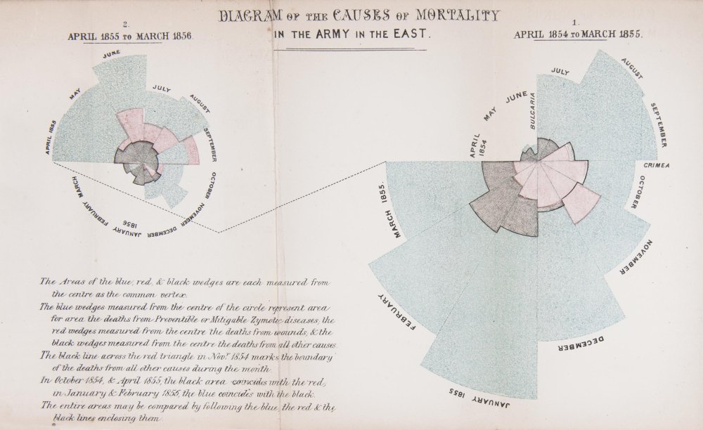
The area of the wedge shows the number of soldiers who died that month. The blue/gray area represented deaths from preventable diseases (due to terrible conditons), the red areas represented deaths from battlefield wounds, and, finally, the black areas represented deaths from other causes. Her core question was, “Why are these men dying?” was the driver and the problem she was trying to address with her visualization. In the 1850s, she knew the power of visualization to communicate an insight powerfully and effectively. She was able to demonstrate to powerful stakeholders that more soldiers were dying from preventable diseases than from battefield wounds countering the belief that most deaths came from wounds. This insight led to changes that had a huge positive impact and difference in mortality (death rates decreased).