My previous data visualization course only briefly introduced us to Tableau because the course was more of a broad overview of data visualization and communication principles in general. It introduced various tools along the way including Excel, PowerBI, Python, and, Tableau. We had the option to use any one of these tools for our various assignments and I mostly stuck with Excel because it was the tool that I was most familiar with when it came to charts, graphs, etc. I did transition to utilizing Plotly for Python for my final project.
So, considering my recent exploration of Tableau, I was excited to find out that this course, Large Data Visualization utilized Tableau as the primary tool. What I loved about this course, however, was that it was not a course simply teaching Tableau. It included lots of hands-on projects along the way, as well as, content on data visualization theory and best practices. It required you to learn and develop your Tableau skills (if you didn’t already have them) in order to complete the projects. The intro modules included a quick overview of data literacy and I was re-introduced to Florence Nightingale, John Snow’s cholera map, and, Edward Tufte’s work by way of the Art of Data Visualization documentary (which was a little dated but still relevant).
I had come across the book, “Storytelling with Data” multiple times before but had not made the time to actually read through it. I was happy to find out that this was a required text. Unlike other required texts in other courses, this book was, fortunately, used extensively throughout the course.

Apart from installing and setting up Tableau, the first assignment consisted of, first, finding and choosing a dataset. I chose the CIRIGHTS data set, which according to the site is the “largest human rights dataset in the world.” This project scores a representative sample of all internationally recognized human rights for all countries of the world covering 40 years. The next part was to compile an accompanying data dictionary for the dataset.
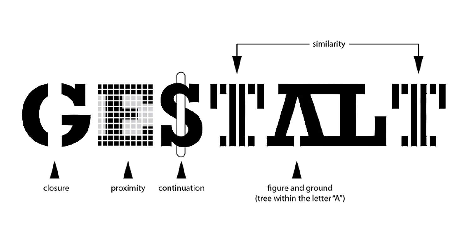
The next module continued with the theory behind the rationale for the use of data visualization (The Why of Data Viz) and an introduction to Tableau Prep. The assignment deliverable required that we demonstrate that we could utilize Tablea Prep for our chosen data set (connect to it, review/implement it’s prep recommendations, and, utilize the Flow pane). The course continued with design and visualization theory utilizing readings and content from the textbook and also utilizing Tableau to begin creating basic and then more advanced charts with our chosen dataset (including getting critique/feedback from others and revising our charts based on that feedback). One of the biggest takeaways from the book for me was how much I was able to understand/grasp the importance of the Gestalt principles when creating data visualizations.

We also created a storyboard for our dataset, learned about and then utilized Tableau’s “Filters and Parameters” on our dataset, learned about and created an updatable report in Tableau, and, finally learned about and built a Tableau dashboard with our dataset, which was our final class project. There’s definitely a lot of room for improvement here, but, not a bad start!
Final Project Presentation Slides - Human Rights Scores 2017-2021
Final Project Presentation Dashboard on Tableau Public
Final Project Video Presentation:
Tools Utilized: Spreadsheets, Python, PowerBI, Tableau, Tableau Prep
Skills Acquired/Developed: Identify, analyze, prepare data. Create and present effective data visualizations with large data sets.
