
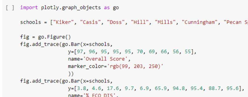
I recently completed the Data Visualization and Communication course and utilized spreadsheets, Python and Plotly to explore and analyze the 2019 AustinISD TEA accountability ratings as my final project!
An analysis of the AustinISD Texas Education Agency accountability statewide ratings for 2019.
Course Description: Introduces principles and techniques for data visualization for creating meaningful displays of quantitative and qualitative data to facilitate decision-making. Emphasis is placed on the identification of patterns, trends and differences among data sets.
The tools used in the course included Excel, PowerBI, Tableau, Python (MatPlotLib, Seaborn, Plotly) and covered graphic design principles (color, text, interaction, perception), exploratory data analysis, and implementing data visualization techniques through charts and interactive dashboards. To supplement this intro into data visualization, I also completed the Python for Data Visualization and Data Visualization with Plotly courses during this semester. These two courses helped me to utilize Plotly for Python in my final project.
One of the most important takeaways from this course was being introduced to the work of Edward Tufte and the classical works in the history of data visualization through his book, The Visual Display of Quantitative Information.